Showing posts sorted by relevance for query Common Cliff Dragon. Sort by date Show all posts

Wednesday, September 7, 2022

Bits and Pieces of Inspiration

 By Jan S. Gephardt

Sometimes a creative person “takes dictation from God” (or the muse, or whatever divine inspiration you want to evoke). That’s when the flow is strong and all the words, strokes, notes, or steps come out just right. Other times we are like gleaners coming into a field after the harvesters have been there. That’s when we find ourselves scrambling to find bits and pieces of inspiration.

For the past few days I’ve been in the “scrambling gleaners” group. All over the place mentally. With lots of disparate “input” coming my way. The bits and pieces of inspiration are like little sparkling jewels scattered through deep straw. They’re there. But what do they mean? How can I bring them together into some kind of a “whole” that works?


“Take your inspiration from wherever you find it, no matter how ridiculous.” — Roy H. Williams
Words to live by. Especially the “ridiculous” part. (Quotefancy).


Bits and Pieces

A great example of “bits and pieces of inspiration” lurks in my studio. They are paper sculpture projects I started years earlier but for various reasons couldn’t figure out how to finish. These are not “failed projects,” mind you. They just have to wait to be rediscovered at an opportune moment.

You see, when it comes to creative projects, I follow the adage “never throw anything away.” This drives my “neatnik” son crazy sometimes. But I’ve learned the hard way. About the time I think I’m never going to need something, a serendipitous idea tends to happen along. All at once, it’s the perfect “writing prompt” for the next scene. Or it’s a handy piece of already-drawn, colored, sculpted, and assembled artwork to match with this other thing that didn’t work with the original concept.

I do this often in my writing. But it’s easier to illustrate the idea with my paper sculpture.


The first dragon of the pair: top, the original 2014 drawing on a circle. L-R below: The first of several compositions to “star” this dragon was “Blue Pounce,” 2016. Another variation is “Aka-Bekko Dragon,” 2017, featuring iridescent paint and a scale pattern based on koi fish.
From its start as a drawing in 2014 (top), this little dragon “starred” in several art pieces. At left, Blue Pounce, 2016. At right, Aka-Bekko Dragon, 2017, inspired by the colors of a kind of koi fish. All images are ©2014-2017 by Jan S. Gephardt.


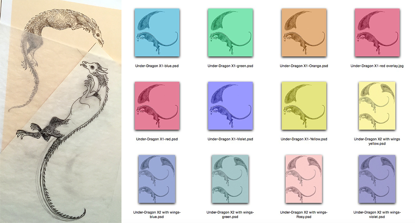
The second, “under-dragon” made its appearance in 2016. Pencil and ink on a tracing paper overlay ensured the two dragons intertwined as I wanted. Then I tested a variety of colors for the next layer.
The “under-dragon” didn’t go through quite as many variations, but after creating it as a pencil and ink drawing on an acid-free tracing paper overlay I tested it in several colors. Artwork is ©2016 by Jan S. Gephardt.


A Tale of Two Dragons

For a long time I’d had a concept of trying to create a circular composition with dragons in midair. I tried several sketches and they just didn’t please me. Nothing looked quite right to me. Finally in 2014 I got a “leaping dragon” on a circular trajectory that I liked. But when I tried to do a “reflected” version of that sketch for the “other half” of the draconian air-circle, it didn’t work. They were awkward with each other. Their tails didn’t fit. It was just bad.

I needed a different dragon. Tracing paper overlays and more frustration followed. I did “dragon variations” on the first design for other purposes. I sculpted it in larger and smaller sizes and made it different colors. Created Koi-patterned approaches. Painted it with iridescent paint before I cut and sculpted it. Most of those experiments sold within a few showings, so people must’ve found them interesting. But I wasn’t satisfied.


“Common Cliff Dragon – Male” at left is Jan’s best-selling multiple original. It depicts a cliff-dwelling dragon in “mating plumage.” At right, “Coming Through!” features an assertive unicorn stomping through a patch of daylilies.
Left-to-right: Common Cliff Dragon-Male and Coming Through! are shown in roughly proportional sizes. Both are multiple-original paper sculptures are ©2012-2022 by Jan S. Gephardt (these multiple-original iterations of the edition were sculpted and assembled in 2016).


Sometimes it Works, Sometimes it Doesn’t

Of course, I was working on other artwork during this time, as well as writing (and repeatedly rewriting) the manuscript that eventually became What’s Bred in the Bone. That was also the period when I designed Coming Through! and Common Cliff Dragon – Male. Both of those worked exactly as originally designed. Why couldn’t all of my pieces do that?

Because they don’t, that’s why. Sometime in 2016 I finally drew a second dragon that I thought really interacted well with the first. I’d at last managed a good “Yang” to the first dragons “Ying.” They didn’t look like they were fighting, though, so I scrapped that thought. By this time it was 2016, and there was plenty of other strife in the world. But they still needed a background. They couldn’t just do their love-dance in a void. They needed context.


These are some of the newest variations I’ve been exploring. Each piece is 2-3 layers deep and each level has a different color under the same drawing. Bottom levels are darkest (greens, blues, and orange tones), and the upper levels are white. The largest is a 3-inch square. Smaller pieces are 1-inch squares or 1X2-inch rectangles.
Here are the latest “enigmatic pieces” I’ve been working on. The largest is a 3-inch square. It’s a decade-long project: the original ink drawings were made in 2012. All images are ©2012-2022 by Jan S. Gephardt.


Picking Through the Bits and Pieces of Inspiration

So I started digging through the boxes and bins of “parts” in my studio. I’d been doing paper sculpture for quite a while by then. It took going through various phases before I kind of “found myself.” That process had left behind lots of bits and pieces. And when I say “lots” I do mean LOTS.


Here are the contents of two more bins from my studio. They are designs based on a variety of flower and branch forms.
People familiar with my work might recognize some of these “art parts,” from finished pieces in which I’ve used other versions of them. You might even be able to spot some in other photos in this blog post! All images are ©2012-2022 by Jan S. Gephardt.


These bits and pieces of “art parts” vary in style and polish of execution. Some just don’t go together. Some ideas occur to me as a single composition that’s all one drawing. An example of that? Common Cliff Dragon – Male. (The linked blog post goes into greater detail than I can here). It’s made of several pieces, but I did a “base drawing” then made overlays for the parts that needed to be executed separately.

That “needed to be executed separately” part is the thing that all too often gets me into trouble. When I try to bring several pieces that I made separately together into one composition I sometimes discover that I’ve gauged the scale slightly wrong. Or I’ve unintentionally varied the styles. Or maybe the pieces just “fight” with each other visually.


Here are yet more bins full of “art parts.” Most are flower or plant forms, some of which have showed up in other pieces of my artwork. Others include a lioness and an assortment of dragons. Some of those dragons have appeared in my finished art, but not all.
Again, some of you may recognize a number of these “art parts.” Can you spot some of them in other photos in this blog post! All images are ©2012-2022 by Jan S. Gephardt.


Chaos Waiting for Order

When the “art parts” don’t play nice with each other, they go into my holding boxes with the other quarrelsome bits and pieces. I’m not planning to stop making paper sculpture anytime soon, and I’m a patient woman. I mean, seriously. If I were an impatient artist I’d be making some other style of art!

So I put them in a box with some of their other troublesome cousins, and I keep cooking up new things. Or new combinations of old things. Take the pair of brand-new originals I debuted at Chicon 8 last week. Both are the result of “voyages of discovery” through the bits and pieces that hadn’t worked all that well in earlier combinations. Or they did work well, but that piece came together, was sold, and I’d thought it was completed. In this case, I found a background in my files that offered interesting potential. Here’s how the “variations” came out.


Here are two different artistic expressions on the same background “base design,” each piece “recycles” paper sculptural bits and pieces in a different way.
Variations on a background: each of these original works uses a common background drawing, but for quite different creative statements. L-R: Overcoming Complications and Gemflower Outburst, both © 2014-2022 by Jan S. Gephardt.


Love in the Storm

Remember the “Tale of Two Dragons,” above? When I left off in that story, I finally had a dragon pair that I liked, but not a background. What to do? Seeking inspiration, I went back through my bits and pieces. Eventually I found a “crashing wave” that looked promising. It hadn’t worked out as the background of an earlier piece, but I figured I might need it sometime. For something.

Well, that might work, I thought. So I made three copies of it and went to work. With a little cutting and fitting, it created a great background (in my opinion) for my “air-circle” dragons. I stepped back, lived with it for a while, and realized the waves formed a sort of a heart-shape. Woot! Serendipity won the day! That’s the origin-story for Love in the Storm, now a steadily-selling limited edition of multiple originals.


A green dragon and a red dragon conduct a wild mating dance in an atmosphere full of crashing waves.
The original composition of Love in the Storm finally came together in 2016. This paper sculpture is ©2014-2016 by Jan S. Gephardt.


Bits and Pieces of Inspiration

I look upon my boxes and bins of “art parts” as bits and pieces of inspiration. They continue to yield up treasures from time to time, although sometimes it takes years. I’ll give you another example, The Silver Lady Appears.

I started with a set of Alhambra-inspired columns in 2012 and tried a bunch of ideas and combinations that didn’t work. No matter what I did with it, it looked like a stage-set waiting for the actors. Probably close to a dozen ideas “auditioned” on that stage. Nope. Nada. Nothing.

Nothing, that is, until I found a way to paper-sculpt and assemble acid-free tracing paper. Then the Silver Lady materialized on the stage that had been waiting more than half a decade for her. And at that point the piece came right together.


The Silver Lady appeared at last in 2020, on the stage that had been in the process of being prepared for her since 2012.
It took from 2012 to 2020, but she finally showed up. The Silver Lady Appears, ©2012-2020 by Jan S. Gephardt.


After all that, you probably know what kind of advice I’m going to offer to anyone who’s involved in a creative pursuit in any field. However you do it, be it in a journal, digital files, or half-a-dozen bins of “art parts,” don’t throw away your “didn’t quite work” ideas. You never know when your next project might need some of those bits and pieces of inspiration!

IMAGE CREDITS

Most of the images in this post are straight out of the author’s digital files. All of the paper sculpture in this post is original artwork © 2012-2022 by Jan S. Gephardt. She also created all of the montages. Many thanks also to Quotefancy, for the Roy H. Williams quote at the top of the post.

Friday, July 21, 2017

Common Cliff Dragon--Male


The Artdog Image of Interest 
This month I've been posting some of my own artwork for my Images of Interest. This is a representative image from my edition of multiple originals titled Common Cliff Dragon--Male. It was recently listed in my Etsy shop, Artdog Paper Sculpture.

My three drawings from 2012, inked and scanned.

It was developed from three pencil drawings I did back in 2012, each created to overlay the one below. The "cliff surface" is one layer, the dragon's body is the second, and the dragon's wings are the third. Once the three were aligned on tracing paper, I inked them, scanned them, then colored each using Adobe Illustrator and a Wacom "Bamboo" tablet.

These are the pieces I cut out.

The artwork prints out as five different pieces: the border base (on heavier archival stock) with the title in the rectangle; the cliff face (sculpted and floated over the base), the body of the dragon; and finally two layers of wings, one more heavily sculpted and glued over the lower layer for a better 3D effect.

Here's the assembly process.

Then it's time to cut the pieces out, which I do with small, precise scissors (they go dull so much less often than X-Acto knives! Then I sculpt with clay-working tools on the flat surface of paper laid over corkboard, assemble the pieces, and it begins to look almost alive, sometimes.

IMAGES: All images are by me, of pieces of a paper sculpture made by me, Jan S. Gephardt. You may use them online, if you'll provide accurate attribution and a link back. Thanks!

Thursday, February 2, 2017

How I make my paper sculptures

I first started making paper sculpture in 2007, but during the first few years I tried a variety of techniques and media before I settled into a pattern that works for me. I have drawn upon my background in printmaking, graphic design, and pen-and-ink illustration to develop my own way of doing things.

1. It starts with a drawing.
During the early years I experimented with cutting freehand shapes out of acid-free paper of various colors, but this didn't give me the flexibility or the control I wanted. I'd always been a pen-and-ink artist, so eventually I gravitated back to that. 

First come the pencils, then the ink. I erase the pencil lines after the ink dries if I want a more clear, crisp line, but leave some or all of the pencil lines in, if I want a softer look in the scan.

I draw on tracing paper to create wings or other overlapping levels: pencils, then inks.

I sometimes draw my original ink drawings on acid-free, finer-tooth white drawing paper, while other times I'll use tracing paper overlays to make separate parts of an image.

2. Next step: a scan.
I love using hand-applied colors, especially with Prismacolor pencils, gouache, or acrylic paint. However, I soon discovered that a scan can turn the pigment colors muddy, when reproduced. Now I nearly always scan my ink drawings before I add any color.

3. After the scan, I add color.
I use Adobe Photoshop and/or Adobe Illustrator to add color to my ink drawings. This gives me several advantages. I can make variations on the base drawing's colors--or make versions in entirely different colors--depending on the effect I'm going for.
Using digital media makes it possible to make the same "base drawing" in several different color variations.

4. Create "pieces to print" pages.
Here's where using the digital component really comes in handy. I normally export the color work as a JPEG, once I'm ready for the next step. This gives me a lot of flexibility. I can adjust the size of the printed images according to my needs, and I also can make a master "to print" page that contains several repeats of the image I want.

This is one of the "pieces to print" pages for Coming Through!, a multiple original edition I started in 2012.

5. Print copies of my "pieces to print" pages.
I always use archival-quality, acid-free paper and fade-resistant inks for my printouts. No ink is totally lightfast in direct sunlight or high humidity, but I try to ensure that with proper care I've used inks that will keep their bright colors as long as possible. I also like to print on several different weights of paper.

Whenever possible, I print what are to become the upper layers on 20-lb. paper, for maximum flexibility with strength. The Southworth Archival Business Papers I normally use take embossing quite well without tearing, and hold the impressions without losing their sculpted form.

I prefer to print the base layer for any image on heavier stock, ideally 62-lb. paper (sometimes I'll print intermediate layers on 32-lb. paper, depending on need and availability).
2-up dragon wings, one of the "pieces to print" pages for my Common Cliff Dragon--Male multiple original edition.


6. Cut out the images.
Now comes what I call the "lap art." Cutting out the images is exacting work, but it also can be tedious. I normally station myself in front of the television, with a lap desk or corkboard to catch the clippings, for this part. It's also a great thing to do with my hands while talking on the phone--kind of like some people crochet or do cross-stitch.

A lot of people ask if I use an X-ACTO knife for this. In general, no. X-ACTO blades get dull way fast for this kind of work, and then they tear the paper. I vastly prefer a small pair of very sharp scissors for most of this work. Until they grow dull (which takes a lot longer), they give me considerably more control on curves or intricate shapes. If there's an inner shape to cut, sometimes in that case I'll use an X-ACTO.

Here are pieces of a Coming Through! in various stages of being cut out, on a corkboard with two of my more indispensable tools: small, sharp scissors and my favorite tweezers.

7. Sculpt the cut-out pieces.
Now comes the actual sculpture-part. I have a variety of tools, some originally designed for leather working or bookbinding, a few stolen from my old set of etching tools, and others taken from my pottery-making tools. They help me burnish, crease, emboss, and otherwise manipulate the paper (especially the 20-lb. stock) to stretch and mold it into 3-D bas-relief forms.

Here are some more of my favorite tools.

8. Assemble and glue together. 
Once the pieces are sculpted, it's time to put them together. Normally I ensure the raised forms will stay raised to the desired level by gluing little rolls of paper to the backs. These become the anchor-points for attaching upper layers to the heavier, lower layers.
Two layers of the Protector dragon: the 20-lb. layer is easier to emboss and crease. The 62-lb. layer (at right) anchors the sculpted top layer so it holds its form. The rolls of paper (on the back of the piece at left) provide dimension and anchor points.

If there are little creatures, leaves, etc. that are distinct parts (such as a dragon, a unicorn, a clump of grass, or a tree, I'll sculpt and assemble them first, then layer them into the larger image I'm creating. Once it's all assembled and glued together, it needs to dry at least overnight.

Once I've sculpted them and stabilized them on a solid base layer, I can create quite a bit of dimension, even at a very small size. These guys (made for the editions Protector [L] and Brave) would just fit into a 2-inch square.
As you can see, it's a rather complex process from concept to finished piece. Sometimes a work is so complicated, I can't face going through all that rigamarole more than once. Or perhaps I had to use some kind of hand-coloring or embellishment to finish it to my satisfaction. In such cases, there can only be one. 

But for most of the pieces I've been making in recent years, my little printmaker soul can't stand to do all that work and only end up with one piece as the final product. Instead, I'm turning them into limited editions--but as you see, each is made individually by hand, and if you look carefully it's easy to see small variations. Thus, each is unique: a true multiple original.

A Common Cliff Dragon--Male waits to be matted. Pieces need to dry at least overnight, after they've been sculpted and assembled.

So far, all my editions are limited to 25 copies. I figure that's about all of any one design I'll be able to stand making, and by then I'll have made others I'm more interested in doing. Unlike traditional plate-based multiple-original print editions, however, I'm discovering that as I make these pieces I find better and more effective ways to give them a truly sculpted and well-defined execution. I make each piece to the best of my ability, but the latter ones in the edition may actually be "better" than the earlier ones, thanks to the learning curve.

9. Sign, number, etc.
The piece is not complete until it has been appropriately marked. A one-off original will usually have my signature hidden in it somewhere, but other times that's not possible. In those cases I'll sign and date it at the bottom.

The multiple-originals follow a more traditional numbering-and-signing format: the marking "AP" and/or a fraction-like number, frequently along with the date or dates (those also may be on the right), goes in the lower left-hand corner. In the middle, I'll write the title in quotation marks. On the right is my signature. Here are a couple of examples, along with a guide to how to interpret those otherwise-possibly-cryptic markings:

This edition originated in 2017 and this particular piece was made in 2017. It is #2 of an edition of 25 originals. The title is Protector, and it was created by yours truly.
This one's a little more complicated. It's an Artist's Proof (AP), the second of three experimental works I created from several printed pieces. I've been trying to find a good way to complete these pieces since 2013, but I think I've figured it out.
To alleviate the mystery a little more, each piece comes with an information sheet that tells about it and explains the markings.

IMAGES: All photos were taken by me of my artwork. You may use them unaltered, IF you include an attribution and a link back to this page. Thanks!

Thursday, May 29, 2014

May: A Good Month to Re-Home Jan's Art!

Denizen of the Winter Trees, 2009
I love selling art to someone who appreciates it. 

I've been able to do that twice this month--and in each case an original found a new home where I hope it will reward the new owners with enjoyable viewing for a long time.

As I mentioned in an earlier post, I have scheduled myself for three science fiction conventions in May and June. So far, I've sold an original piece of artwork at each of the conventions I've attended.

Denizen of the Winter Trees
Demicon 25 was held in Des Moines, IA May 2-4, and my 2009 piece, Denizen of the Winter Trees found its new home there.

Treetop Primaries, 2009: more Twig Dragons.
Denizen was an important piece for me, when I made it in 2009. I had not done too many paper sculptures at the time, and I was still experimenting with my materials. I conceived the idea of creating small "fire-lizard size" dragons (Thank you, Anne McCaffrey, for the idea of fire lizards), which could perch on real twigs.  I had a yard full of twigs and sticks, courtesy of the large sliver maple tree in my front yard.

My 7-piece "Dragon Parts" stencil
I created a seven-piece pattern for making the dragon's body, head, and wings, with the idea that I could create a series of "Twig Dragons." I used the pattern like a stencil to transfer a pencil outline from the pattern to acid-free paper, inked and painted in the details, sculpted, and assembled the piece onto a real silver maple twig.  The background trees are painted with Winsor & Newton watercolors on Arches watercolor paper. It was a pretty labor-intensive process.  I only made one other "Twig Dragons" piece, the larger work Treetop Primaries, 2009.

All of my "Snowflake Dragons," as well as the multiple original Common Cliff Dragon-Male, 2012, are descendants of the Twig Dragons, because I adapted that original stencil design to create them.

Horsefeathers
Horsefeathers in 2012: finished, but with no background!
I have an even longer-standing love affair with horses than I do with dragons (in strictest honesty, there's more than a little "horse" in my dragons). Horses were my absolute favorite subject to draw, paint, read about, and write about, all the time I was growing up.  It's no surprise, then, that the fantasy "pegasus" or winged horse is a subject I've returned to many times in my career as a fantasy artist.

Black-Headed Heron,2012
Horsefeathers 2012 was mostly created during March and April of that year, inspired by the design I'd created for the wing of my Black-Headed Heron. I liked the way the wing had turned out, so I adapted the pattern I'd created for it, and made my horse's wing.

You may note, if you know horses, that this horse isn't the usual light, airy little Arabian normally paired with a set of pegasus wings in fantasy art.  No, this guy's a Percheron, with maybe a little Shire or Clydesdale thrown in there. The idea of a "heavy" horse with wings appealed to my sense of irony--and the icing on the cake was the hair on the feet. Those luxuriant, furry feet are called "feathers."

How could I resist?

Horsefeathers has a new home.
I am happy to report that, thanks to Signy Gephardt's helpful eye, I was able to find a framing approach that worked much better for my "heavy pegasus" than anything I'd previously tried: velvety black to set him off.  The proof that I'd found his best presentation approach came when I promptly sold him at ConQuesT 45, which I attended May 22-24, 2014 in Kansas City! He has gone home to live with the obviously-tasteful Terry Matz and Ken Keller.

As the paper sculptures have gotten more elaborate (and I've gotten better at making them), the complexity of the patterns has gone up.  Horsefeathers was created from 15 different pieces, based on tracing paper overlays of an original drawing. The pieces were cut from (acid-free archival) Canson colored paper, and subtle additional color was added using Prismacolor artists' pencils, both before and after cutting. Then they were sculpted and assembled.

Look for me at SoonerCon 23!
My convention-going isn't over yet, and I still have more artwork to sell.  My art and I plan to be in Midwest City, OK (Oklahoma City metro area) June 27-29, 2014 for SoonerCon 23. Perhaps I'll see you there.

IMAGES: All photos are by Jan S. Gephardt, of her artwork (and also her friend, in one case!). If you use or re-post them, please do so with attribution and a link back.  Thanks!

Friday, July 20, 2018

An award-winning experiment finds a home

The Artdog Image of Interest


One of the nicest things that happened for me while I was at Westercon/MALCon (Myths and Legends Convention) in Denver earlier this month was receiving a blue ribbon in the 3D category at the Art Show. I feel very honored, because there was a lot of wonderful 3D artwork in this show.

The honored piece was a special, one-of-a-kind Artist's Proof (abbreviated AP) of the Common Cliff Dragon--Male collection of multiple originals. I called it the "spiny ridge" AP because in a fit of madness I experimented with cutting out each individual scale on the ridge along the dragon's back, then sculpting them to stand up slightly.


I took the second photo in December 2016 before I matted the piece. I have to admit it looked pretty cool, but it was a delicate operation, it took a long time, and when I'd finished I swore I'd never do that again. Granted, one should "never say 'never,'" but now I'm officially on record that it was a one-of-a-kind experiment.

A one-of-a-kind experiment that was awarded this wonderful honor, and one which also has now been "rehomed" with a new owner. The owner got some prize-winning new art, but I was the one who got to keep the ribbon!

IMAGES: Both photographs were taken by me, Jan S. Gephardt, of my own artwork. If you wish to re-post or reblog either of them you may, as long as you include an attribution to me and a link back to this post. Thank you!


Wednesday, July 11, 2018

Impressions from Denver

Preliminary reflections 
on Westercon 71/MALCon 6
I'm freshly back from Denver, and the 71st Westercon, hosted by Myths and Legends Con 6, a Shiny Garden event. The first panels and an opening reception began on Wednesday, July 4, 2018; the last events and Closing Ceremonies came on Sunday, July 8.

The reception on the 12th floor of the Hyatt Regency Denver Tech Center at Westercon 71/MALCon 6 on the first night (July 4, 2018) gave us a panoramic view of several municipal fireworks displays in Denver and along the Front Range of the Rockies. They went on for at least an hour.

I intend to devote at least one more post to the programming (possibly more), but I'm still waiting on a couple of things, so today I'd like to give some more general impressions. As I noted last week, I managed to miss connecting with the Programming folks. As a result, this was a very unusual con for me in one way--no panels to prepare for or moderate! 

So I did what any truefan would do: I volunteered when possible, to help out. Science fiction fandom runs on volunteer power--and the best way to get to know people is to participate. 


Here's a photo from the Art Show setup at Westercon 71/MALCon 6 in Denver. We had a pretty small space but Art Show Director Bruce Miller (far L, white hair with his back to us) and his MileHiCon Art Show Team who could make it--some were ill, sadly--have this setup thing down to a process. My son and traveling companion Tyrell Gephardt (3rd from right in the background) and I helped as we could. I can't see well enough to identify the guy in the middle by the doorway, but the woman in the foreground right is Lizzie Newell, a fellow paper sculptor! (although her work and mine are different). At far right in the background you can see about half of Robert Pechmann, a mainstay of Bruce's Art Show Team.

Mostly, I volunteered in the Art Show. Having been the Art Show Director at ConQuesT for three years, before gratefully turning it over to the capable and talented Mikah McCullough, and having been involved in art shows since the early 1980s (including co-writing the original version of the ASFA Art Show Guidelines with Richard Pini, in intense consultation with Teresa Patterson, who is writing now but was running art shows then), art shows at sf cons are my "natural environment." I like to think I helped, this weekend.

Here are two views from above: at left are fan tables and several general-interest booths; at right is a view from the catwalk above, of gamers enjoying tabletop games inside the atrium at the Hyatt Regency Denver Tech Center.

As noted above, at least one more blog post in this space will deal with the panels I attended at Westercon 71/MALCon 6, but in more general terms I'd like to quote from a journal entry I wrote on Saturday of the convention (July 7, 2018), about my experience:

"I feel as if I’ve been attending an intensive writers’ and artist’s immersion experience this week. My typical day has been a wake-up into immediately thinking about my book, working on the book, then working in the Art Show, surrounded with amazing art and interacting with some of the people who made it, going to panels that are (at their best) almost like graduate-level seminars on the topic of the panel—frequently thought-provoking, even when they don’t reach that pinnacle. Evenings have been spent reviewing the day’s events and input, discussing experiences with Ty, and more writing."

To my surprise and delight, theArt Show Judges (independent from any influence by the Art Show Staff I'd become a temporary part of) awarded me with a First Prize in the 3D category. The picture they honored was the one-of-a-kind "Spiny Ridge" version of the multiple original Common Cliff Dragon--Male. As I explained to Bruce, I don't intend to tie up my time with anything that intricate again! We'll see how long that resolve holds out.
After the better part of a full week at the convention, I must say my mood was divided. Part of me wanted to linger longer (maybe get more work done), but we also needed to get home!

Heading out on Monday, July 9, 2018: My little green Subaru fit right in, with the Denver crowd. The Hyatt Regency Denver Tech Center has a lot of glass in that atrium.
IMAGES: All photos in this post were taken by Jan S. Gephardt, including the one of Jan's own artwork. Please feel free to re-post, reblog, share, or tweet any of these photos, but please include an attribution and a link back to this page. Many thanks!

Thursday, December 1, 2016

"Coming Through!" multiple-original paper sculpture joins my Etsy lineup

I thought you might like to know I have a new limited edition multiple original listed in my Etsy shop.

I've listed two Artist's Proofs of the image Coming Through!, which features an assertive unicorn powering through a patch of day lilies.


These particular Artist's Proofs represent a very short run of two. The variations are lighter-yellow lilies than I've decided to offer in the eventual edition of 25, and a "floating" oval that is cut out and elevated above the backing.

I originally created the Coming Through! image in 2012, but I've been playing with variations on it ever since. In all its variations, it has been well-received at the science fiction conventions where it has been exhibited, but I'm hoping the Etsy listing will gain me a larger audience. Why not offer something in time for Christmas, right? (If I can get things matted, I hope to offer more soon).

Here's a look at some of the pieces I must cut out and sculpt, to create a Coming Through!

As with any of my multiple originals, each of these pieces is unique. Even when working from a digital output, the cutting, sculpting and assembly process requires individual, hands-on work. No two are exactly alike, although I do try to create a consistent edition once I find a combination that works for me.

The proofing process is the way I find that combination. These two proofs ended up not being practical for an entire edition, but I hope their unique qualities also will appeal to art-fanciers.

I score the back of each piece, then turn it over and work the front, each time I create a piece of paper sculpture.
I was an undergraduate art major with a Printmaking emphasis, so creating these multiple originals is second-nature for me. I spent a good part of my young adult life as a graphic designer (when I wasn't being an art teacher, a mom, or a writer), and I still use the Creative Suite to manipulate my images digitally.

If you count the 2011 Mail Piece Project's five multi-dimensional artworks as my first three-dimensional multiple originals (as I do--click on the links for glimpses of the New Year's, Spring, Summer, Fall, and Winter Mail Pieces--dang, I didn't document that series as well as I thought I had!), then Coming Through! is my seventh foray into multiple original imagery. The sixth (or first, if you count stand-alone pieces that aren't part of a series) was Common Cliff Dragon--Male, which I'll list on Etsy and feature here once I've gotten mats and spacers cut.

IMAGES: All images are photos taken by me, of pieces of my own artwork. You're welcome to download and re-blog them, but please include a link back and an attribution. Many thanks!

Wednesday, June 9, 2021

Virtual ConQuesT 52

 By Jan S. Gephardt

Compared to some authors I’m slow, but Virtual ConQuesT 52 was my first virtual sf convention using interactive video tools.

Throughout the months since March 2020 I’ve periodically participated in Facebook-based Concellation. Last year I pre-recorded myself reading Chapter One of The Other Side of Fear for Virtual DemiCon 31. But this year I was in the final throes of preparing a finished draft of A Bone to Pick, and just didn’t have the psychic energy for Virtual DemiCon 32 (my friends in Des Moines were very gracious and understanding, for which I thank them).


One for the Home Team

Readers who’ve followed this blog/my Artdog Adventures blog for several years may remember that ConQuesT in Kansas City is my “home” convention. I’ve blogged about it many times over the years (follow the links for examples).

ConQuesT didn’t exactly have a convention last year. But they had more time to organize a virtual event this year. For the first time in decades I didn’t participate in the ConQuesT Art Show, but I did agree to participate in panels. So, how did Virtual ConQuesT 52 go?

Well, in some ways it was almost like being on regular panels.

How did they Conduct the Panels at Virtual ConQuesT 52?

We conducted our panels on Zoom. By now I guess everyone who regularly uses a computer for communication has experienced a Zoom meeting. My writers group has stayed in weekly contact all through the pandemic by using Zoom, so I was well familiar with this interface.

A cartoon by Tom Fishburne demonstrates some typical Zoom meeting issues.
We had the occasional frozen screen during Virtual ConQuesT 52, but not often (by permission from Tom Fishburne, The Marketoonist).

I also have been on Discord chats before, but this was my first really positive experience with the program. Previous attempts have been unguided attempts to connect with groups who also didn’t seem to have much clue what they were doing with it. This time around, with people actually interacting, I enjoyed it (more on that in a bit).

Once the live-on-Zoom panels were finished, the concom posted recordings of them on a dedicated Twitch channel. That way if you were a member of the convention you could access the panel any time you wanted during the con. Once I figured out how to get on, it was pretty easy to use.

An Art Panel at Virtual ConQuesT 52

I may not have had artwork in the show, but I did participate in one art-related panel at Virtual ConQuesT 52. I moderated, facilitating a discussion of each artist’s unique approach.

Panelists were our Artist Guest of Honor, Toni Taylor, graphic designer/artist/game creator Harold Sipe, and fellow Kansas City artist Allison Stein. I misunderstood the end-time, so I kinda aced myself out of my own process description (I demonstrated how I created Common Cliff-Dragon—Male).

The ConQuesT panel description for "Behind the Curtain”: The Process Behind the Art read: “Every artist develops their own style, and works with their tools in their own way. In this panel, the moderator will display some of the art by the artists on the panel, and give the artists some space to walk through the process of creating the piece, giving a view “behind the curtain” into their artistic processes.”

Screen-grab from Virtual ConQuesT 52’s Twitch feed.
Here’s a glimpse of how the video for “Behind the Curtain” looked on Twitch. (Image courtesy of ConQuesT 52).


Toni Taylor, Starchild Art

Each of the panelists has a unique take on their approach to their artwork. Taylor described some of the considerations that go into her portraits, including totems, spirit animals, and places that hold special meaning for the subject. See some of them on her website and Facebook page.

Harold Sipe, Small Monsters Games

Sipe gave us a behind-the-scenes look at how he and his wife conceived of their “Takeout” card game, and the process they went through to refine the idea, then design, test, and build it. He also showed us screen-shares of the finished cards, and his website.

Allison Stein, Author, Artist, TV Addict, Geek Princess, and Cat Servant

Stein described the ways she develops her whimsical creations, featuring birds of all types (my particular favorites are her owls), bunnies, octopi, cats, dragons, and more. She described the wide range of media from which she selects tools and add-ons to make each tiny piece unique. Catch glimpses on her website, Fine Art America page, and Etsy store.

My Panels with Writers at Virtual ConQuesT 52

Most of my panels at Virtual ConQuesT 52 involved some aspect of writing. I moderated all but one. Allison Stein, who also is a writer as well as an artist, moderated that one, about writers groups, and she handled it brilliantly. Barbara E. Hill, Lynette M. Burrows, and M. C. Chambers joined us for that one. We discussed several excellent local writers’ groups and how important it can be for a writer to find a good one.

4 screen-grabs from Virtual ConQuesT 52’s Twitch feed.
This montage shows moments from each of my four writing-related panels on Twitch (Images courtesy of ConQuesT 52. Montage by Jan S. Gephardt.)

We discussed our personal publishing journeys (each one different) with Guests of Honor Becky Chambers (no relation to M. C., as far as I'm aware) and Dan Wells, plus the science fiction writer Claire McCague. Readers of this blog know I’m a partner in Weird Sisters Publishing.

Two other writing-related panels focused on specialized writing topics.

Food in Fantasy provided a fun conversation with Claire McCaig and Reed Alexander. It explored all the ways that food can and has featured in both culture and pivotal scenes. We explored our own writing, and also the writing of others.

Trials and Tribulations of Running an Interstellar Space Station is probably going to provide a basis for a future blog post. Guest of Honor Becky Chambers, science fiction writer Claire McCague, and dedicated science fiction fan Michael Kingsley joined me for that one.

Overall a Good Experience at Virtual ConQuesT 52

We experienced a number of tech glitches during my first panel on Friday. How's Your Apocalypse was mostly designed to introduce Guests of Honor Becky Chambers, Dan Wells, and Toni Taylor. But Friday afternoon of the con is usually a lightly-attended time period. And once we got the bugs worked out, the convention went well, as far as I could tell.

Screen-grab from Virtual ConQuesT 52’s Twitch feed.
Here’s a glimpse of how the video for “How was Your Apocalypse?” looked on Twitch. (Image courtesy of ConQuesT 52).

I won't say I want to conduct all-virtual conventions from now on. But the more we use the technology, the more possibilities open up. People who wouldn’t have been able to attend in person had a chance to participate virtually.

The Twitch feed with its recordings opened the previously-unavailable opportunity to view and enjoy panels, even when they ran opposite something else I wanted to see. Now that we have the technology and know how to use it, I hope more and more conventions maintain a virtual presence. Even when the main event goes back to in-person.

Have you participated in a virtual science fiction convention? Please use the Comments section below to tell us what you thought!

IMAGE CREDITS

Many, many, many thanks to our image sources for this post! We appreciate the gracious Tom Fishburne, The Marketoonist, for permission to use his cartoon on this post, and we’re forever indebted to Virtual ConQuesT 52 and their guests for permission to post screen-grabs from their Twitch feed. This blog post would be pretty boring to look at without them!