Showing posts with label paper sculpture. Show all posts

Wednesday, September 7, 2022

Bits and Pieces of Inspiration

 By Jan S. Gephardt

Sometimes a creative person “takes dictation from God” (or the muse, or whatever divine inspiration you want to evoke). That’s when the flow is strong and all the words, strokes, notes, or steps come out just right. Other times we are like gleaners coming into a field after the harvesters have been there. That’s when we find ourselves scrambling to find bits and pieces of inspiration.

For the past few days I’ve been in the “scrambling gleaners” group. All over the place mentally. With lots of disparate “input” coming my way. The bits and pieces of inspiration are like little sparkling jewels scattered through deep straw. They’re there. But what do they mean? How can I bring them together into some kind of a “whole” that works?


“Take your inspiration from wherever you find it, no matter how ridiculous.” — Roy H. Williams
Words to live by. Especially the “ridiculous” part. (Quotefancy).


Bits and Pieces

A great example of “bits and pieces of inspiration” lurks in my studio. They are paper sculpture projects I started years earlier but for various reasons couldn’t figure out how to finish. These are not “failed projects,” mind you. They just have to wait to be rediscovered at an opportune moment.

You see, when it comes to creative projects, I follow the adage “never throw anything away.” This drives my “neatnik” son crazy sometimes. But I’ve learned the hard way. About the time I think I’m never going to need something, a serendipitous idea tends to happen along. All at once, it’s the perfect “writing prompt” for the next scene. Or it’s a handy piece of already-drawn, colored, sculpted, and assembled artwork to match with this other thing that didn’t work with the original concept.

I do this often in my writing. But it’s easier to illustrate the idea with my paper sculpture.


The first dragon of the pair: top, the original 2014 drawing on a circle. L-R below: The first of several compositions to “star” this dragon was “Blue Pounce,” 2016. Another variation is “Aka-Bekko Dragon,” 2017, featuring iridescent paint and a scale pattern based on koi fish.
From its start as a drawing in 2014 (top), this little dragon “starred” in several art pieces. At left, Blue Pounce, 2016. At right, Aka-Bekko Dragon, 2017, inspired by the colors of a kind of koi fish. All images are ©2014-2017 by Jan S. Gephardt.


The second, “under-dragon” made its appearance in 2016. Pencil and ink on a tracing paper overlay ensured the two dragons intertwined as I wanted. Then I tested a variety of colors for the next layer.
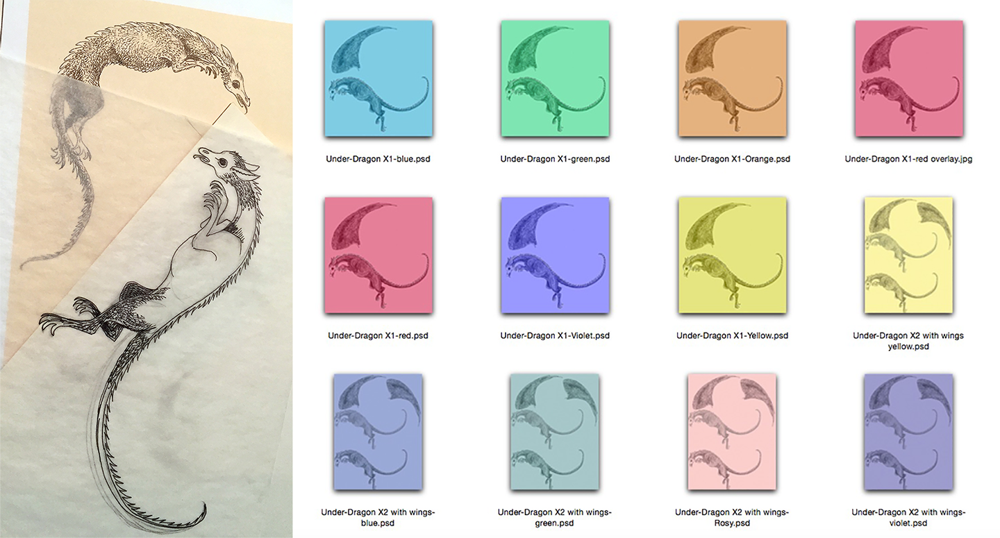
The “under-dragon” didn’t go through quite as many variations, but after creating it as a pencil and ink drawing on an acid-free tracing paper overlay I tested it in several colors. Artwork is ©2016 by Jan S. Gephardt.


A Tale of Two Dragons

For a long time I’d had a concept of trying to create a circular composition with dragons in midair. I tried several sketches and they just didn’t please me. Nothing looked quite right to me. Finally in 2014 I got a “leaping dragon” on a circular trajectory that I liked. But when I tried to do a “reflected” version of that sketch for the “other half” of the draconian air-circle, it didn’t work. They were awkward with each other. Their tails didn’t fit. It was just bad.

I needed a different dragon. Tracing paper overlays and more frustration followed. I did “dragon variations” on the first design for other purposes. I sculpted it in larger and smaller sizes and made it different colors. Created Koi-patterned approaches. Painted it with iridescent paint before I cut and sculpted it. Most of those experiments sold within a few showings, so people must’ve found them interesting. But I wasn’t satisfied.


“Common Cliff Dragon – Male” at left is Jan’s best-selling multiple original. It depicts a cliff-dwelling dragon in “mating plumage.” At right, “Coming Through!” features an assertive unicorn stomping through a patch of daylilies.
Left-to-right: Common Cliff Dragon-Male and Coming Through! are shown in roughly proportional sizes. Both are multiple-original paper sculptures are ©2012-2022 by Jan S. Gephardt (these multiple-original iterations of the edition were sculpted and assembled in 2016).


Sometimes it Works, Sometimes it Doesn’t

Of course, I was working on other artwork during this time, as well as writing (and repeatedly rewriting) the manuscript that eventually became What’s Bred in the Bone. That was also the period when I designed Coming Through! and Common Cliff Dragon – Male. Both of those worked exactly as originally designed. Why couldn’t all of my pieces do that?

Because they don’t, that’s why. Sometime in 2016 I finally drew a second dragon that I thought really interacted well with the first. I’d at last managed a good “Yang” to the first dragons “Ying.” They didn’t look like they were fighting, though, so I scrapped that thought. By this time it was 2016, and there was plenty of other strife in the world. But they still needed a background. They couldn’t just do their love-dance in a void. They needed context.


These are some of the newest variations I’ve been exploring. Each piece is 2-3 layers deep and each level has a different color under the same drawing. Bottom levels are darkest (greens, blues, and orange tones), and the upper levels are white. The largest is a 3-inch square. Smaller pieces are 1-inch squares or 1X2-inch rectangles.
Here are the latest “enigmatic pieces” I’ve been working on. The largest is a 3-inch square. It’s a decade-long project: the original ink drawings were made in 2012. All images are ©2012-2022 by Jan S. Gephardt.


Picking Through the Bits and Pieces of Inspiration

So I started digging through the boxes and bins of “parts” in my studio. I’d been doing paper sculpture for quite a while by then. It took going through various phases before I kind of “found myself.” That process had left behind lots of bits and pieces. And when I say “lots” I do mean LOTS.


Here are the contents of two more bins from my studio. They are designs based on a variety of flower and branch forms.
People familiar with my work might recognize some of these “art parts,” from finished pieces in which I’ve used other versions of them. You might even be able to spot some in other photos in this blog post! All images are ©2012-2022 by Jan S. Gephardt.


These bits and pieces of “art parts” vary in style and polish of execution. Some just don’t go together. Some ideas occur to me as a single composition that’s all one drawing. An example of that? Common Cliff Dragon – Male. (The linked blog post goes into greater detail than I can here). It’s made of several pieces, but I did a “base drawing” then made overlays for the parts that needed to be executed separately.

That “needed to be executed separately” part is the thing that all too often gets me into trouble. When I try to bring several pieces that I made separately together into one composition I sometimes discover that I’ve gauged the scale slightly wrong. Or I’ve unintentionally varied the styles. Or maybe the pieces just “fight” with each other visually.


Here are yet more bins full of “art parts.” Most are flower or plant forms, some of which have showed up in other pieces of my artwork. Others include a lioness and an assortment of dragons. Some of those dragons have appeared in my finished art, but not all.
Again, some of you may recognize a number of these “art parts.” Can you spot some of them in other photos in this blog post! All images are ©2012-2022 by Jan S. Gephardt.


Chaos Waiting for Order

When the “art parts” don’t play nice with each other, they go into my holding boxes with the other quarrelsome bits and pieces. I’m not planning to stop making paper sculpture anytime soon, and I’m a patient woman. I mean, seriously. If I were an impatient artist I’d be making some other style of art!

So I put them in a box with some of their other troublesome cousins, and I keep cooking up new things. Or new combinations of old things. Take the pair of brand-new originals I debuted at Chicon 8 last week. Both are the result of “voyages of discovery” through the bits and pieces that hadn’t worked all that well in earlier combinations. Or they did work well, but that piece came together, was sold, and I’d thought it was completed. In this case, I found a background in my files that offered interesting potential. Here’s how the “variations” came out.


Here are two different artistic expressions on the same background “base design,” each piece “recycles” paper sculptural bits and pieces in a different way.
Variations on a background: each of these original works uses a common background drawing, but for quite different creative statements. L-R: Overcoming Complications and Gemflower Outburst, both © 2014-2022 by Jan S. Gephardt.


Love in the Storm

Remember the “Tale of Two Dragons,” above? When I left off in that story, I finally had a dragon pair that I liked, but not a background. What to do? Seeking inspiration, I went back through my bits and pieces. Eventually I found a “crashing wave” that looked promising. It hadn’t worked out as the background of an earlier piece, but I figured I might need it sometime. For something.

Well, that might work, I thought. So I made three copies of it and went to work. With a little cutting and fitting, it created a great background (in my opinion) for my “air-circle” dragons. I stepped back, lived with it for a while, and realized the waves formed a sort of a heart-shape. Woot! Serendipity won the day! That’s the origin-story for Love in the Storm, now a steadily-selling limited edition of multiple originals.


A green dragon and a red dragon conduct a wild mating dance in an atmosphere full of crashing waves.
The original composition of Love in the Storm finally came together in 2016. This paper sculpture is ©2014-2016 by Jan S. Gephardt.


Bits and Pieces of Inspiration

I look upon my boxes and bins of “art parts” as bits and pieces of inspiration. They continue to yield up treasures from time to time, although sometimes it takes years. I’ll give you another example, The Silver Lady Appears.

I started with a set of Alhambra-inspired columns in 2012 and tried a bunch of ideas and combinations that didn’t work. No matter what I did with it, it looked like a stage-set waiting for the actors. Probably close to a dozen ideas “auditioned” on that stage. Nope. Nada. Nothing.

Nothing, that is, until I found a way to paper-sculpt and assemble acid-free tracing paper. Then the Silver Lady materialized on the stage that had been waiting more than half a decade for her. And at that point the piece came right together.


The Silver Lady appeared at last in 2020, on the stage that had been in the process of being prepared for her since 2012.
It took from 2012 to 2020, but she finally showed up. The Silver Lady Appears, ©2012-2020 by Jan S. Gephardt.


After all that, you probably know what kind of advice I’m going to offer to anyone who’s involved in a creative pursuit in any field. However you do it, be it in a journal, digital files, or half-a-dozen bins of “art parts,” don’t throw away your “didn’t quite work” ideas. You never know when your next project might need some of those bits and pieces of inspiration!

IMAGE CREDITS

Most of the images in this post are straight out of the author’s digital files. All of the paper sculpture in this post is original artwork © 2012-2022 by Jan S. Gephardt. She also created all of the montages. Many thanks also to Quotefancy, for the Roy H. Williams quote at the top of the post.

Wednesday, July 13, 2022

A Very Busy SoonerCon

By Jan S. Gephardt

SoonerCon 30 was a very busy SoonerCon for me. I had a chance to once again share one end of a sales table (this time in the Creators Alley). But I didn’t want to give up being on panels or in the Art Show. This was guaranteed to be a little crazymaking.

But it was so lovely to be back at SoonerCon! It’s one of my favorite conventions, as you can see if you look through my past blog posts about it. In a lot of ways it feels like an “adopted second ‘home con.’” SoonerCon has been very good to me, my artwork, and my books over the years!

So, during the Pandemic I contributed several sets of autographed XK9 books and one of my larger pieces of paper sculpture to their online auction fundraiser. I contributed to their Kickstarter, too. And I made sure I bought space for Weird Sisters Publishing in their digital and program Book advertising. In my opinion all of those efforts to support the convention are “Win-Win” efforts. When SoonerCon survives and thrives, my businesses have an excellent outlet for this and future years.


The Weird Sisters Publishing ads at SoonerCon 30 included three digital images at left, and a print ad in the program book.
Three digital ads and a print ad helped both SoonerCon and Weird Sisters Publishing. (images from Weird Sisters Publishing LLC).


A Very Busy SoonerCon Art Show

In its former home at the Reed Conference Center the SoonerCon Art Show was shoehorned into a relatively small space. Everything was cramped, and the sightlines were short. You couldn’t back up to view a whole panel without the risk of running into someone else’s art panel. Not so in their new home at the Embassy Suites by Hilton Norman Hotel & Conference Center!

This year the SoonerCon Art Show was enormous, and the artwork was of very high quality. I enjoyed wonderful displays from Artist GoH Elizabeth Leggett, plus Rachael Mayo, Lucy A. Synk, and almost everyone else I pointed out in my two ConQuesT 53 Art Show posts. Chaz Kemp, Peri Charlifu, and other notable members of the Convention Artists Guild turned out in force with large and beautiful collections.


Two photos from the SoonerCon Art Show portray Jan’s display of paper sculpture and Lucy A. Synk’s paintings and prints.
Two SoonerCon Art Show display panels show work by Jan S. Gephardt and Lucy A. Synk. (See credits below).


Other artists whose work caught my eye? Vanessa Green’s embroidery, Brooke Lydick’s quilting, and Rachel Karch’s striking mixed-media/polymer clay provided marvelous examples of striking work in unusual media. I loved the ingenuity of Joshua Cook’s imaginative metal sculptures of fantasy creatures (or are they machines?). Kelly Stoll, whom I understand to be Rachael Mayo’s sister, created exquisite fantasy miniatures on brooches and pendants. But the tour de force (and a top crowd-pleaser) of the entire, massive show were the amazing dioramas of Beth Lockhart. Lockhart also displayed beautiful painted gourds and chainmail dragons.

A Very Busy SoonerCon Panelist Schedule, too!

Before I knew I’d be holding down one end of a sales table all weekend, I had told the Programming people to “use me and abuse me.” At most conventions, my appearances on panels have been the major way I can communicate anything about myself, my artwork, and my books. I also (as I’ve mentioned a few hundred times in my blog posts) love to moderate panels, even though it’s extra work. The SoonerCon Programming people know this. They also seem to think I do a decent job of it, so I moderate a lot of my SoonerCon panels.


Two photos from my reading.
I love going to readings, but this year I only got to one: my own, along with (L-R: Selina Rosen, an unidentified audience member, Melinda LeFevers, Donna Frayser, and Tim Frayser. (See credits below).


This created the perfect recipe for a very busy SoonerCon programming schedule! On Friday I had two panels, one of which I moderated, plus an Author Reading. It was the only one I managed to attend. That night, the Art Show Reception provided a great chance to see the show and visit with lots of people. On Saturday, in addition to my Autographing session, I moderated three panels and enjoyed a late-evening Artists’ Chat. That turned out to be quite interesting and enjoyable. I hope they keep it on as a repeating feature!

On Sundays, I always ask not to be scheduled opposite Art Show check-out. Occasionally programming people ignore this, but I always appreciate it when I don’t have to throw myself on my son Ty’s mercy to avoid messing up the Art Show Staff’s teardown/load-out schedule. This time the programmers managed to both respect my Art Show commitment and schedule me for one last panel – a fun one called “Wry Wit for Writers: Humorous Fiction.” We laughed a lot, and I was pleased to be able to join the fun.


Three photos focus on the three authors’ displays on the “Bad Bards and Beyond” sales table.
L-R: Rie Sheridan Rose created a copper-pipe “Steampunk” rack to display her books, DVDs, and other materials. In the center of the table are polymer clay figures, magnets, four books and other items from Mel. White. On the other end is Jan’s display of signs and XK9 books. (See credits below).


“Bad Bards and Beyond” – Another Shared Sales Table

The final part of my recipe for a very busy SoonerCon came from the last-minute addition of the “Bad Bards and Beyond” sales table. (Our books and I are the “Beyond” part). This table was almost as successful as my table at ConQuesT 53. That’s even though all the other commitments meant I spent considerably less time working it. We may have been positioned at the end of a long hallway, but there was a lot happening “out in our neck.” Things never got dull that I saw, and traffic stayed pretty busy.

My table-mates were Mel. White (Dr. Mel. White, Ph.D., to be formal) and Rie Sheridan Rose, both from Texas. I’ve know Mel. for what seems like donkeys’ years through the conventions, and she and Ty have independently struck up a pleasant friendship. We memorably hung out a lot together at NorthAmericon ’17 in Puerto Rico. I’ve known Rie less well, but we’ve amicably bumped into each other at SoonerCon, FenCon, and probably others in the past. The three of us spent the weekend deciding we made a pretty good team and planning to meet again at FenCon . . . but then a development made it important to cancel my attendance at the September convention.


Jan traveled with Weird Sisters Publishing signs, copies of her books, and bookmarks to Archon 44 in 2021.
Here I am with my “traveling display” at Archon 44 in 2021. (Tyrell E. Gephardt).


Meet My “Bad Bards and Beyond” Table-Mates

Mel. White

Mel. White’s bio on her Amazon page (she doesn’t seem to have an author website) describes her as a “Professor, scientist, artist, author, educator, and former computer programmer [who] writes science fiction and draws webcomics.” She and the late Robert Asprin created the “Duncan and Mallory” graphic novels (there were three), first published by Starblaze Graphics, 1986-1988. Aspirin died in 2008. Mel. has written many anthologized stories over the years. With co-author John DeLaughter, she re-launched the "Duncan and Mallory" series in 2018.

She earned her Ph.D. in Information Science in 2014, and followed that with work on a degree in Egyptology. Mel. is an adjunct professor (Egyptology and Anthropology) at Dallas College Richland Campus. She also works on dinosaur bones at the Perot Museum and pursues other pursuits. A longtime and accomplished filker, her music is part of the reason we called our table “Bad Bards And Beyond,” though I’m less sure about the “bad” part.

Rie Sheridan Rose

I’m grateful that Rie has a website, where it’s been easier to find (dated) biographical information. When her bio says she’s “contributed to innumerable anthologies,” she’s not kidding! Her Amazon Author Page goes on for pages and pages. Most of the items listed are anthologies. She’s also a prolific poet, as well as a filker and lyricist (the other part of the “Bards” in the table’s name).

But she’s also up to twelve novels now, if her website’s “My Work” page is up to date. Many are fantasy works. She’s also the author of the 5-book Conn-Mann Chronicles Steampunk series, as well as other Steampunk books and stories. In the “Steampunk spirit,” she’d created a fun little book rack for her end of our table, made of copper pipes.


The “Duncan And Mallory” series in their original covers by Mel. White form part of a montage that also shows Mel’s “Syskitty” avatar, which she uses on Facebook, Rie Sheridan Rose’s author photo, and the series image for Rie’s “Conn-Mann Chronicles.”
My table-mates Mel. White and Rie Sheridan Rose have produced a number of interesting fiction projects. (See credits below).


As you can imagine, all of these elements came together to create a very busy SoonerCon 30 for yours truly. But, as SoonerCon always proves to be for me, it also was a fun, stimulating, and utterly worthwhile weekend. I’m already looking forward to next year!

IMAGE CREDITS

Jan S. Gephardt took many of the photos in this post myself (as noted in cutlines). She designed all of the advertising and other graphics for Weird Sisters Publishing with skillful help from illustrations © by Chaz Kemp, Lucy A. Synk, and Jody A. Lee and used with authorization. The photo of Lucy’s artwork display was taken with her permission. My son Tyrell E. Gephardt took the photos of my art display in the SoonerCon Art Show. He also took the photo of me with all my books and signs at Archon 44 (2021).

The photos from my reading portray fellow authors/readers Selina Rosen, Melinda LaFevers, and Tim Frayser, along with his wife Donna Frayser and an unnamed audience member. All photos were taken with permission by their subjects.

The “Mel And Rie” Montage pulled imagery from several sources. The original three “Duncan and Mallory” covers are part of a screen-capture from Google Search. Mel’s Facebook avatar, “Syskitty,” came from her Facebook page. Rie’s author photo came from her Amazon Author Page. The “Conn-Mann Chronicles Series” graphic is courtesy of the Amazon page for that series. Many thanks to all!

Saturday, February 16, 2019

My Capricon 39 Art Panels

The Artdog Image of Interest

Kicking off the year with a panel comprised of both old and new . . .


IMAGE: I took this photo (with Art Show permission) of my own art at the Capricon 39 Art Show. Reuse or reblog if you wish, but please do it with a "by Jan S. Gephardt" attribution, and a link back to this page. Thanks!

Wednesday, January 25, 2017

What is a multiple original?

Lately I've been making more and more multiple-original limited editions of paper sculptures. But what does that mean?

Essentially, it means that each image is made by hand, and that each image is in some ways unique, although it is part of a consistent edition, limited to a particular number of prints. And what does that mean? The answer will take a little explanation, and a short walk through art history:

Commercial mass-printing methods
In my experience, the term "multiple original" arose about thirty-plus years ago, when photo-offset lithography (also called "offset litho" and/or "photo offset" printing) became widespread and affordable enough for individual artists to make reproductions of their own artwork.

This sheet-fed offset litho press dates from 1980. It, and others of its type, revolutionized the art reproduction print business (for more details see the credits at the end of this post).

Suddenly, artists could produce and sell high-quality reproductions of their work by the hundreds, thousands, or tens of thousands (technically, far more are possible. But that was the practical outer limit). These prints were all virtually identical, no matter whether it was the first print off the press or the 10,000th.

Traditional, handmade printing methods
Of course, that's not at all the way art prints had been made, up until that point. Handmade, individual prints had been created for centuries (and are still being made) in small editions. Rembrandt is known for his etchings, as well as his oil paintings. He is certainly not the only artist who was a printmaker. Hokusai's woodblock prints and Daumier's lithographs are other examples of masterworks created through hand-printing methods.

Hand-pulled original prints such as this lithograph are printed by an artist or artisanal printer one at a time by hand. The printing plates used for these processes break down quickly, so a print from early in the edition will be more crisp and clear than one from later in the edition.
In traditionally-made editions, the print number makes a difference. An artist numbers the prints sequentially, based on the order in which they were printed. Print number 1/20 means that this piece was the first print made in a total edition of twenty prints.

The prints in an edition should all look as much alike as possible, to be considered "consistent." Consistent handmade print editions are technically difficult to produce, and prints made early in the edition are often of better quality, because the plate has not broken down significantly yet (when it breaks down too much, the edition ends). However, a commercially-produced offset litho edition, potentially numbering in the thousands of prints, produces identical images, and requires no artistic skill.

Inevitable controversy
When artists in the 1980s began to produce offset-litho reproductions of their prints, a huge controversy arose, especially because they often numbered them, just as prints in hand-pulled editions were numbered. This confused many art-buyers, and, not surprisingly, tended to outrage artists who used those technically-challenging traditional printmaking methods.

Yet the new reproduction method made it possible for artists in "slow" media such as oil and acrylic painting to sell their images as they never had been able to before. It also fulfilled a need among would-be art buyers who had never been able to afford the kinds of art they liked best, before. Now an artist didn't have to be able to make originals quickly to make a good living selling his or her work to a wider retail audience.

Artists who exhibit their work at art fairs such as this one (the Kansas City Plaza Art Fair in 2013) or in other, similar venues have more ways to offer their work to buyers in a wide range of prices, thanks to more affordable mass-printing methods. 
A matter of terminology
It became clear that distinctions had to be made. If a print has that fraction-like number on it, buyers need to know what that means. Is it a hand-pulled lithograph or a photo-offset lithograph? Is it a handmade serigraph, or an inkjet-printed giclée? Is the sequence number an indicator of print quality, or simply an inventory number? What does "limited" mean, if an edition is "limited" to several hundred? Part of the answer lies in an art-buyer's knowledge, and his/her understanding of the differences. Artists can and should help educate them if they aren't sure. 

When something is identified as a "lithograph," it should mean that the print was produced through the traditional hand-printing method (as in the photo of the artist above) that uses a smooth stone and the principle that oil and water don't mix--not that it was printed using the related-but-much-different process of commercial offset lithography.

Printed paper money provides another example of mass-produced identical images in limited, numbered quantities. The rules about making that kind of printed image are a little bit different from the rules about art prints, though! 
Mass-produced images that are essentially photographic copies of originals made in other media (such as oil paintings, pastels, etc.) are appropriately called fine art reproduction prints, not lithographs, serigraphs, etchings, etc. Those terms should be reserved only for the corresponding hand-printmaking methods.

Fine art reproduction prints usually come in limited editions. That means the artist has limited the number of reproduction prints that s/he will make to a particular number. If you see the fraction-like number 234/500, that means this is a fine art reproduction print from an edition limited to 500. The "234" is primarily there as an inventory number, and to reassure the buyer that it is the only "234" available. It's a double-check on the artist's integrity. If there is no number on the print, that means it is an open edition. In an open edition there is no limit to the number of reproductions that may be made.

Chris Pig of East London Printmakers uses
a brayer to roll out ink for a woodcut, a similar
technique to the printing method used by Hokusai.
Traditional hand-printmaking methods are understood to be multiple originals. This means each one is made by hand, and it is in some ways unique, because small variations arise from the process of making it (such as from the plate breaking down in subtle ways, although that's not the only possible source of variations).

I feel justified in calling my limited editions of paper sculpture multiple originals,  because although some of the early parts of their creation involve the inkjet-printing method often called giclée (generally considered a reproduction-print technique), each individual piece is made by hand, one at a time, and each image invariably has small variations that arise from the process of making it. My editions also have so far been limited to small editions of 25 images each (plus some Artist's Proofs, a term I plan to define in a follow-up post). This is much more in line with the editions created by traditional hand-printmaking methods.

Next week I will describe how I make my limited-edition multiple original paper sculptures, step-by-step.

IMAGES: The photo of the photo-offset press (an Einfarben-Bogenoffset-Druckmaschine, Type "Roland Favorit RF01", Baujahr 1980 Hersteller: M.A.N.-Roland Druckmaschinen Aktiengesellschaft, Offenbach am Main Foto aus dem Deutschen Mudeum in München) is used by permission of the copyright holder, Clemens Pfeiffer of Vienna, Austria. It was made available via Wikimedia. Many thanks! 
The photo of the (unnamed) artist making a lithograph is from Orange Carton's blog post, "Do You Know What an 'Original' Art Print Means?" The article discusses the topic in some depth. Check it out, to learn more. 
I took the photo of crowds and booths at the Plaza Art Fair in Kansas City, MO in September 2013. It is available for use by others if you include a link back and attribution.
The photo of the sheets of uncut pound notes is from The Commentator. The photo of master printmaker Chris Pig is from East London Printmakers. Many thanks!