Showing posts with label Jeff Porter. Show all posts

Wednesday, June 8, 2022

A Sampler of Excellent Artists at ConQuesT 53

 By Jan S. Gephardt

ConQuesT 53 offered quite a sampler excellent artists. It really was a beautiful show, a credit to both the artists and the Art Show director, Mikah McCullough (ably assisted by his wife Katarina Gibb, and his Corgi Renji). I don’t have time or room to feature them all, but several of them impressed me with the range, beauty, and inventiveness of their work. Most had new things that I haven’t seen at ConQuesT before.

For the short profiles offered below, I have borrowed liberally from the artists’ self-posted biographies. Please note that I did need to edit most for length and to fit the needs of this blog post. However, it is not my intention to misrepresent the facts stated in them.

As for the artwork shown, “fair use” standards are always tricky when one hasn’t had the “bandwidth” (because of illness and family urgencies to attend to) to contact all of these artists ahead of time. Lacking their expressed wishes, I have only used photos that they themselves authorized to be publicly posted – either on their own websites or on the ConQuesT Art Show Facebook page. I strongly encourage you to explore their work at more depth on their websites.


The ConQuesT 53 Art Show in a panoramic photo that shows the entire display.
A panorama of the ConQuesT 53 Art Show, just prior to the end of the silent auction. (Mikah McCullough/ConQuesT Art Show).


Lucy A. Synk

Yes, I’m biased. And please note that this post’s sampler of excellent artists isn’t all ranked according to “who Jan knows best” order. But I just had to start here. As frequent readers of this blog know, Lucy A. Synk and I are close friends. She painted the cover art for my novella The Other Side of Fear. She is a member of my first-to-be-consulted Brain Trust (along with my sister G. S. Norwood and Dora Furlong), whenever I have new XK9 stories that need feedback. And readers of both this blog and my Newsletter know her as the artist who frequently creates developmental and promotional images of characters from Rana Station.

Lucy has exhibited her art at science fiction conventions, Renaissance Festivals, and art fairs.  She illustrated magazines and books in both the U.S. and Europe, most notably the cover for Andre Norton’s book Wizard’s Worlds. She also continued to hone her various skills in painting and portraiture. Through more than a decade of work in the natural history exhibit industry, Lucy painted murals and illustrations. She considers her Cretaceous mural, installed at the Burpee Museum of Natural History in Rockford, IL, the high point of that career (scroll down on this page to see the mural).

Lucy is now exploring new directions for her artwork. Experiments with "Dirty Pour" and Mixed Media techniques resulted in her Planets series and the fantasy sea/ship paintings. She also has created some wonderful new still-life and Plein Aire paintings, and has embarked on an ambitious series of paintings called the "Rejoicing in Our Differences" series.

Arden Ellen Nixon

No sampler of excellent artists at ConQuesT 53’s Art Show would be complete without Arden Ellen Nixon’s work. Especially not, since she’s recently returned to full-time “artist-ing” and had some new-to-me work in this show.

I first encountered Arden’s work when I was the Art Show Director at ConQuesT myself, back in the dark times before Mikah McCullough took the helm. Since then we’ve become friendly acquaintances (I once had fun giving her a tour of the Nelson-Atkins Museum of Art). Here’s what she has to say about herself and her art.

“Hello! I am Arden Ellen Nixon, and I will be your charmingly awkward artist this evening. It is my sincerest wish for my paintings to find the beauty in the dark--as with my extensive "Make-Shift Angel" series--the silly in the sublime, and the humanity shared by the creatures and the world around us. Legend has it that I could draw before I could walk. While I don't know about that, I do know that I bought my first set of acrylics at thirteen. I found my starter set at a hardware store, of all places, on clearance for $13.75. "Why not?" I thought--little did I know! When not painting, you'll find me pursuing my love of ancient history, watching soccer--Come On You Spurs!--with my husband, and visiting whatever zoo or museum is available at the time.”
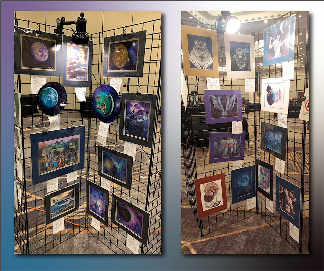

The ConQuesT 53 displays of L-R: Lucy A. Synk and Arden Ellen Nixon.
L-R: Displays by Lucy A. Synk and Arden Ellen Nixon. (See credits below).


Jeff Porter

I worked with Jeff Porter on a few early XK9 developmental images, after I discovered his artwork at ConQuesT. Back then, he was deeply involved in creating the game “Xenofera,” which opened the door to a whole new avenue of illustration work for him. I’ve watched it unfold with great interest. I collected bits from his online bio for the introduction below.

Jeff, he is a freelance Illustrator from the Midwestern United States. He grew up in Kansas City, Missouri, and very early in life realized the passion he had for creating art. He graduated from Raytown South High School, and then joined the United States Marine Corps for a four-year tour of service as an artillery cannoneer. After the service, Jeff started attending art classes at Longview Community College and later the University of Central Missouri, graduating in 2009 with a degree in Commercial Illustration. In 2013, he received his MFA from the University of Hartford's limited residency program under the guidance of Murray Tinkelman. He now spends his time staying busy working on projects and learning as much as he can about the field of art and illustration.

Mike Cole

I have no idea when I first met Mike Cole. He’s been a (very funny and enjoyable) fixture at midwestern science fiction conventions for a long time. Since he lives in the St. Louis area, there’s a good chance our first encounter happened at an Archon! But whenever we met, he definitely belongs in this sampler of excellent artists.

Mike has been drawing since he was three years old. He has been displaying his artwork at science fiction conventions across the country for the last 25 years. Currently he lives in St. Charles, MO in a multi-level comic book storage facility. A science fiction fan since the early 70’s, Mike has attended, volunteered, run, and doomed, (don’t ask) something on the order of 300 conventions. He is a working artist as well as creating award winning digital artwork, and covers for Yard Dog Press.


Screen-grabs from the website homepages of Jeff Porter and Mike Cole.
From the websites of Jeff Porter and Mike Cole. (See credits below).


Sarah Clemens

I first encountered the artwork of Sarah Clemens the same way I did Arden’s, the first year I was the ConQuesT Art Show Director. I’ve been delightedly following her work ever since. My daughter Signy is among her devoted fans (she’s collected several of Sarah’s prints). Sarah works primarily in oils, but has also tried her hand at rock-painting and sculpture. She’s probably best known for her “Magnus and Loki” series, about a cat and a small dragon who are partners in hijinks.

“Working in oils brings everything into focus,” Clemens writes in her online bio. “I have had to work in all types of media to make a living as an artist and I pride myself on doing well in all of them, but oils…they’re special. Perhaps it’s the sense of history and tradition that makes them unique. There is also something extraordinary about they way you can push the pigments around a canvas. Oil has a luminosity, a gem-like glow. Moving the to Southwest has given me new ideas for painting, and for the first time, I am doing landscapes and flowers, along with the figure studies I love so much.”

Sara Felix

I met Sara Felix through ASFA, the Association of Science Fiction and Fantasy artists. It seems to me that she’s been the President of ASFA for at least 2-3 terms (it’s a job that has burned out many people over the decades, so I’m in awe of her stamina!). And with no fewer than six Hugo Awards in her CV, she surely deserves to be included in my sampler of excellent artists!

Sara describes herself as a mixed media artist. Her works are typically done in alcohol ink, acrylics and resin. She also creates a weekly tiara for Tiara Tuesday and has created over 100 unique tiaras in the project. Whenever she can, she teaches online and in-person classes. They typically sell out quickly because she has a large following with her creations.

She has been guest of honor at multiple conventions across the states and shows at science fiction art shows when she can. Her design work includes two Hugo bases, the 2016 base and the 2018 Hugo base co-designed with Vincent Villafranca. She also has designed three WSFS Young Adult Award/Lodestar awards as well as the nominee pins.


Screen-grabs from, L-R, the “Magnus and Loki” online gallery of Sarah Clemens and the “Tiara Gallery” of Sara Felix.
At left, Sarah Clemens’ Magnus and Loki are always up to something. At right, catch a glimpse of the stunning beauty and variety of Sara Felix’s fantasy tiaras. Her “Tiara Tuesdays” are a regular social media feature. (See credits below).


The Convention Artists Guild

The Convention Artists Guild was strong with us, this ConQuesT, so naturally several of them belong in my sampler of excellent artists at ConQuesT 53. What is the Convention Artists Guild? Here’s how they describe themselves:

“We are a group of professional & semi-professional Colorado artists who participate in Convention art shows and events. Our work is exhibited in Art Shows and Vendor Rooms alike throughout the country . . . It is our intention as a group to provide: support, trust, collaboration, aid, resources, information, motivation, community, education and inclusiveness both within our core group and with the community in general.”

In addition to Founding Member Peri Charlifu, and Remote Member Elizabeth Leggett, both of whose work I’ll examine in greater detail next week, several other CAG members showed their work here. Three in particular caught my eye.

This header says: Convention Artists Guild, Colorado Chapter.
The Facebook Page header for the Convention Artists Guild. (Convention Artists Guild).


Mike Kloepfer

Mike is a Founding Member of the Convention Artists Guild. I think I first met him at a SoonerCon, but it was a while back. I immediately fell in love his luscious, painterly technique. His art looks a lot like it was painted in oils to me, but he actually uses acrylics. I especially love his sense of humor and his anthropomorphized animals. Check out his “Dogs of War,” as well as his “Flyboys” and “Animals of Adventure.” They all look like such interesting characters!

Here's how he introduces himself on his website: “Hi! My name is Mike Kloepfer. My friends call me Mikey. I call my art mikeyzart. I create unique imaginative characters, creatures, and places - Fantasy, SciFi, and Whimsical art, as well as Portraits, Figures, and wildlife. As a professional artist for over 3 decades, my art and myself have appeared in many places: books and magazines, including The Artists Magazine, and Classical Drawing Atelier by Juliette Aristides; as well as galleries, art shows and conventions. I have been a technical illustrator for Microsoft, Boeing and COBE Laboratories, a map-maker for USGS, graphic designer, cartoonist, fine artist, and many other artistic occupations.”

Jim Humble

I first noticed Jim Humble’s artwork about a decade or more ago, at a science fiction convention – possibly at a DemiCon. He, too, offers wonderful, humorous paintings and prints of anthropomorphized animals. His Steampunk Kittens and Star Wars cats are especially fun. But this man has range. He also creates amazing resin and mixed-media sculptures (I particularly enjoy his amazingly intricate dragon sculptures). Give yourself some time to peruse his whole website. It won’t take long to see why he belongs in my sampler of excellent artists.

Here’s his self-introduction: “Some people think I was born with a pencil in one hand and some clay in the other. It's pretty much true. I lucked out since my parents supported my art habit. In fact early on my mother and I baked one of my first clay pieces in the old oven. Of course it was crayola clay and it just melted and stunk up the house! Whoops! Live and learn.

“I've progressed since those days and still strive to improve. My life experiences have shaped my art in particular a 3 year stay in Germany and Europe. There my love of art (in particular the human form, gargoyles, grotesques and mythology) was really intensified. I've been pursuing my vision and passion to create now for more than 20 years.”

Brenna Deutchmann / Whimsical Whiskers

Brenna is another Convention Artists Guild Founding Member, and while she’s also a sculptor, she’s chosen the medium of fiber art. The result is unique, sometimes articulated, stuffed fantasy creatures that range from rather large to keychain-sized. She produces them under the name of Whimsical Whiskers LLC. As she explains on her website:

“All of our products are made with love and care. All of our products are original designs, and all production, sewing and construction are overseen by Brenna, who is the designer and artist.

Accessories and jointed dragons are handmade in Denver, Colorado and the USA by Brenna and local artisans. Each and every dragon is jointed, stuffed and finished by Brenna.

“Some of our products are my original designs but are produced off site in a factory. I work closely with my suppliers to ensure quality, softness of fabric, and ethical production. All are safety tested for age 0 (baby safe). These products include keychain animals, foxes, bunnies, silver and rainbow stripe dragons.”


Whimsical Whiskers’ “Dice Dragons,” a header from Humble Studios featuring a Steampunk Kitten and a mischievous-looking dragon, and a gallery of images representing Mike Kloepfer’s print series represent the three artists.
Clockwise from lower left, “Dice Dragons,” the Humble Studios header, and a “gallery of galleries” offers a representative sample of Mike Kloepfer’s artwork.” (See credits below).


I hope you’ve enjoyed this sampler of excellent artists whose work I enjoyed at ConQuesT 53!

IMAGE CREDITS

As noted in the introduction, out of concern over fair use, I have only used photos that the artists themselves authorized to be publicly posted – either on their own websites or on the ConQuesT Art Show Facebook page. All montages were made by Jan S. Gephardt.

Art Show Director Mikah McCullough took the panoramic shot of the ConQuesT 53 Art Show on Saturday, May 28, just before the silent auction ended. He posted it on Facebook. Jan took the photo of Lucy A. Synk’s 2-panel art show display during Art Show setup on Thursday, May 26, 2022. Mikah McCullough took the photo of Arden Ellen Nixon’s display at about the same time – both with the motive of showing the two mail-in artists how their displays looked. Lucy gave me permission to share hers, while Arden and Mikah shared hers on Facebook.

Jan captured screen-grabs from the website homepages of Jeff Porter and Mike Cole. Likewise, the imagery representing Sarah Clemens is a screen-grab of part of her “Magnus and Loki” online gallery, showing six images, complete with itty-bitty watermarks. The one representing Sara Felix screen-captured nine of the wildly imaginative tiaras for which she is well known. To see more, please visit their websites!

The header image for the Convention Artists Guild came from the organization’s Facebook Page. Three of their members are represented by images in the montage below it. Whimsical Whiskers' “Dice Dragons” came from a Facebook image. Images representing Jim Humble and Mike Kloepfer are screen-grabs from their respective homepages. Many thanks to all, for helping me share this sampler of excellent artists!

Wednesday, March 30, 2022

Visualizing a Character

 By Jan S. Gephardt

For a novelist, visualizing a character – bringing them into focus, learning who they are, and what makes them tick – is absolutely essential. Readers don’t read our books because they fell in love with the plot twists. They don’t seek out a book because they love murder, or war, or the scientific concept that makes a book “science fiction.”

They read our books because they fall in love with our characters.

At least, we writers desperately hope they’ll fall in love with our characters. Or anyway that they’ll be fascinated by them. Because if they don’t care what happens to our characters, all of our clever plot twists have no meaning. The murder or the war is just butchery or mayhem. That ingenious science fictional concept we invented might only make them say, “Oh. Well, that’s kinda interesting. But what’s happening on Tik Tok?”

No, the charactersare key. They’re the point of the story, as far as most readers are concerned. Their trials, their passions. The dangers they face, the risks they brave. And, most importantly for the core archetypal function of literature, the solutions they devise for their terrible problems.


“Books can change your life. Some of the most influential people in our lives are characters we meet in books.” — David McCullough
About a year ago, G.S. Norwood wrote about one of McCullough’s books. (See credits below).


Characters are Everything

When I was first learning to write, people sometimes asked, “is this a plot-driven story, or a character-driven story?” I have come to the conclusion that it’s a literature-analysis question making a point that is irrelevant to the way most readers of fiction engage with the stories they read. For me, every story is “character-driven.” It has to be, or it fails in fundamental ways.

That’s why it’s really important for a writer to know their characters. But it’s all very well and good to say that. How does one go about doing that? Especially when the person one is trying to get to know is an imaginary person in our own head? Because I am here to tell you, they don’t spring fully-formed from my forehead, Zeus-and-Athena-style.

No. Not even a little. Visualizing a character in all their dimensions takes effort and time.

Some writers “interview” their characters. They ask questions such as the character’s favorite color, their favorite food, music, and so on. I’ve tried that. It can be interesting, and occasionally enlightening. Some writers create elaborate backstories or dossiers on their major and semi-major characters. I’ve done some of that, too. And I always try to keep track of how tall, how heavy, eye color, age, and important skills, relationships, and so on – written down in a place I can remember! You might not believe how many times I’ve caught myself and said, “Wait! How much does Rex weigh, again?” (130 kilos, when in good shape). Visualizing a character only works for my readers if I’m consistent.


"Books can truly change our lives: the lives of those who read them, the lives of those who write them. Readers and writers alike discover things they never knew about the world and about themselves." – Lloyd Alexander
Possibly the most influential author in my own childhood, Alexander’s words continue to be true for me, whether I’m the reader or the writer. (See credits below).


How Best to Learn a Character?

I can only tell you what works for me. Sometimes I’ll get to a place in a story where I need someone to do something. Then a new person who is exactly when and where I need them sometimes steps forward. They do what the story needs, but add their own little personal touch to the way it’s done. That’s when visualizing a character is fun and easy. Occasionally I may decide that person needs a promotion to a bigger part in the story! (This is my “pantser” side emerging).

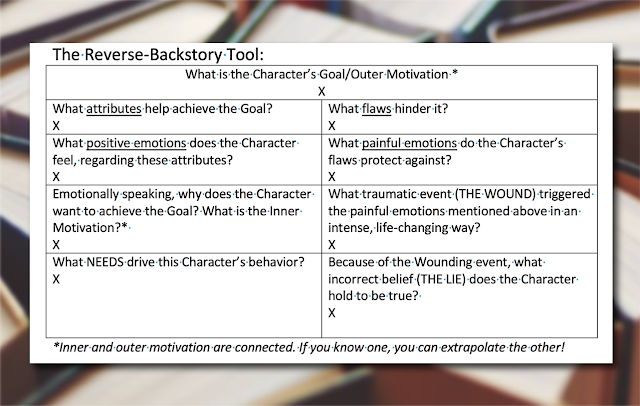
More often I’ll know, going into the story, that certain characters belong onstage. I’ll already know some basic aspects of those characters, but not enough. That’s when I need help visualizing a character. I like to use techniques such as the Character Flaw Pyramid or the Reverse Backstory Tool (see below). If this is getting too technical for you, feel free to skip over this part.

But for the writers and reviewers in my audience, I’ve found these very helpful for developing the Protagonist and Antagonist characters. I’ve also used them for supporting characters who have their own, smaller story arcs within the book.


The Character Flaw Pyramid asks a series of questions for the writer to answer about their character: What lie does the character believe about himself? What was the defining moment? What core flaws result from the lie? What lesser/secondary flaws stem from the core flaws? What are some of the character’s typical behaviors, thoughts, actions, or quirks?
From Jan’s “Writing Techniques” notes; source unclear. (See image credits below).


The Reverse-Backstory Tool is a chart. At the top is the question (with space to fill in an answer), “What is the character’s Goal/Outer Motivation?” An asterisk directs us to a note below the chart, which reminds: “inner and outer motivation are connected. If you know one, you can extrapolate the other!” Below this heading area are two columns with four sections each, asking parallel questions as follows. Section One on the left: “What attributes help achieve the goal?” on the right: “What flaws hinder it?” Section Two, left: “What positive emotions does the character feel, regarding these attributes?” Right: “What painful emotions do the character’s flaws protect against?” Section Three, left: “Emotionally speaking, why does the character want to achieve the goal? What is the inner motivation?” An asterisk directs us back to the note below the chart about inner and outer motivations being connected. Section Three, right: “What traumatic event (the WOUND) triggers the painful emotions mentioned above in an intense, life-changing way?” Section Four, left: “What needs drive this character’s behavior?” Right: “Because of the wounding event, what incorrect belief (the LIE) does the Character hold to be true?”
From Jan’s “Writing Techniques” notes; source unclear. (See image credits below).


I got these . . . somewhere, at some point in the last five years. Probably/possibly they came from one or more of my friends (I hang out with a lot of writers. Possible sources include Dora Furlong and Lynette M. Burrows, but I really don't remember. You might enjoy their books, though!). And I have no idea who, among all the many tutors, online courses, blogs, or writing gurus, originated them. I just know these tools work for me. But there’s also another important method in my toolbox.

Visualizing a Character . . . Literally

When I say I’m visualizing a character, I also mean that literally. I’m an artist, so I think visually and spatially. I make maps. Create floorplans. Collect visual reference photos, and make my own drawings. But I’ve never had the “illustrator” gift. Non-artists may find that confusing, but in my experience not every artist is cut out to be an illustrator. It’s a specific subcategory of skills that I’ve always wished I had! But the ability to create really awesome illustrations is just not a gifting I’ve received or been able to develop (Lord knows, I’ve tried!).

All the same, I am both lucky and blessed. I have many friends who are outstanding illustrators, richly endowed with that gift I wish I had. And, here in the later decades of my life, I also have been blessed with the ability to hire them to do what I can’t.

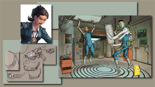
This means my longtime friend Jody A. Lee has made gorgeous covers for the first two novels in the XK9 Trilogy. If you’ve been following this blog since last summer, you may remember reading The Story Behind A Bone to Pick’s Cover. It also means I could commission some early character-and-tech-development images from artist and game designer Jeff Porter. And I could ask the illustrator Jose-Luis Segura to help me visualize two characters, Mac and Yo-yo, whom I intend to feature in a future story.


Clockwise: a finished digital painting of Pamela Gómez, the illustration “Mac and Yo-yo in Their Workshop,” and design sketches of an EStee next to some studies for collar-mounted vocalizers all are examples of visualizing a character or a character’s tools.
Jeff Porter’s 2016 visualization of Pamela Gómez is still the best one Jan has. Jeff’s design concepts for collar-mounted vocalizers and EStees influenced how later artists portrayed them. Jose-Luis Segura invented some creative ideas in his 2021 rendition of Mac and Yo-yo in Their Workshop. (images are ©2016 by Jeff Porter and © 2021 by Jose-Luis Segura. See credits below).


And it means I could embark on a long and ongoing creative collaboration with my good friend Lucy A. Synk.

Visualizing a Character with Lucy A. Synk

I chronicled my collaboration with Lucy to create the cover of my novella The Other Side of Fear on this blog almost exactly two years ago, in March 2020. Lucy was literally Rex’s first fan. She’s a well-regarded professional artist with years in the fantasy and science fiction world, a background in natural history museum murals, and a burgeoning fine art career. She’s about to unveil a brand-new website, so here’s hoping this link redirects properly. If you’re on Facebook, you also can see (and “Like,” if you’re kindly inclined) her Lucy Synk Fantasy Art page.

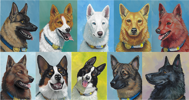
Last winter, she helped me visualize The Orangeboro Pack. She painted all ten XK9s from my books, both as head-and-shoulders portraits and in full-body action poses. I’ve used those a lot, especially in my monthly newsletter.


Head-and shoulders portraits of the ten Orangeboro Pack members.
Top row L-R: Razor, Elle, Crystal, Petunia, and Cinnamon. Bottom Row L-R: Scout, Victor, Tuxedo, Shady, and Rex. (All paintings are ©2020-21 by Lucy A. Synk).


This winter, her project has been to start visualizing the humans in my stories. Since she’s already posted the first two paintings from the new series on her Facebook page, I’ll show them here, too.


The two finished paintings: at left, all-business Hildie, working as a paramedic in microgravity; at right, in a saree on a balcony at home, ready for a party.
Here are the finished paintings, L-R: Hildie at Work and Hildie on a Balcony in a Saree. (Artwork © 2022 by Lucy A. Synk).


Next week, I’ll talk about our ongoing collaborative efforts, and the developmental stages we went through when we were visualizing a character named Hildie Gallagher for these two paintings.

IMAGE CREDITS

Many thanks to Quotefancy, for the David McCullough quote. You may remember that G. S. Norwood blogged about one of McCullough’s books in this space about a year ago. And thank you very much, AZ Quotes, for the wisdom from Lloyd Alexander.

As noted in the post, Jan has no clear idea of exactly where the “Character Flaw Pyramid” or the “Reverse-Backstory Tool” came from. But the photo of the hands holding question-marks up in the air is definitely by "rawpixel," via 123rf. And the pattern of books background certainly came from Madison Butler on LinkedIn and her “Unicorn Nuggets” newsletter. Many thanks to both!

The digital painting of Pamela Gómez and the sketches of an EStee, along with the designs for collar-mounted vocalizers, are all © 2016 by Jeff Porter. The digital painting Mac and Yo-yo in Their Workshop is © 2021 by Jose-Luis Segura. The ten XK9 portraits are © 2020-2021 by Lucy A. Synk. The two new oil paintings of Hildie Gallagher are © 2022 by Lucy A. Synk. Jan enjoyed every minute of those collaborations, and looks forward to doing it again! All montages in this post were designed and assembled by Jan S. Gephardt.

Wednesday, September 1, 2021

The story of A Bone to Pick’s Cover

“A Bone to Pick” by Jan S. Gephardt, envisioned as an ebook on the left and as a trade paperback on the right.
Release day is September 15, 2021! Pre-orders available. Cover artwork is © 2020 by Jody A. Lee.

By Jan S. Gephardt

It’s way too late for this to be a “reveal,” but the story of A Bone to Pick’s Cover deserves telling. Because it was not an easy—or short—journey!

Late update: I unfortunately timed this post just when Jody had retired her old website and hadn't quite gotten her new one ready. If you're reading this in late 2021, her links may not work.

The Artistry of Jody A. Lee

For most of my adult life it has been my secret fantasy that someday my books would have Jody A. Lee covers. She and I have a rather long history, and through it all, I’ve cherished an abiding love and admiration for both her, and her artwork. From the very beginning, long before it seemed like even the remotest possibility, I harbored a fantasy. I dreamed that one day Jody could illustrate a book I had written. It seemed like a crazy pipe dream, back then.

Jody and I met through ASFA, the Association of Science Fiction & Fantasy Artists, back in the 1980s. For quite some time in the ‘80s and early ‘90s, my husband Pascal and I acted as her agent for sending her fine art prints to science fiction conventions all over North America. I also created a couple of printed promotional brochures for her, in an early effort to help market her work directly to fantasy art lovers.

Even though those markets have changed, and changed, and changed again, We’ve been friends since then. In recent years we’d grown more distracted by family and career issues. But when I went to her and asked if she’d ever be willing to paint a cover for me, she said yes! My crazy-pipe-dream-fantasy actually came true. Twice, so far! How many people get to say that?


Left to right, some book covers by Jody A. Lee: “The Black Gryphon,” by Mercedes Lackey and Larry Dixon; “A Study in Sable,” “By the Sword,” and “The Hills Have Spies,” all by Mercedes Lackey.
Jody has range and vision and amazing skill. All of these cover paintings are ©Jody A. Lee (image source credits below).


A Memorable Moment in the Book

Jody reads the current draft of my book before she conceives the cover illustration. She builds it based on a memorable moment. In our first outing, for the cover for What’s Bred in the Bone we considered several scenes. Jody’s portrayal of Shiv and Rex in the Five-Ten worked best. But then came a bunch of those devilish details.

Jody doesn’t normally read a lot of science fiction, especially not “hard” sf. I’d had several readers who were old hands at sf go through the work and have little reported trouble with the descriptions. But Jody was having a devil of a time visualizing some of them. We went round and round on the helmet and background and how to portray them. What did I mean by this or that term? What did one of those things look like?

But eventually we arrived at this characteristic moment for Rex and Shiv, a man who was at that point in the story his SBI “frenemy.” And helping Jody visualize it helped me understand ways to (I hope) make the story more understandable and accessible. I like to think that others are intrigued by the idea of a sapient, talking police dog, even if they primarily read other genres. And maybe they will enjoy the stories more, thanks to my consciousness-raising from Jody.


Left to right, Rex in the Citron Flash; then Shiv and Rex in the Five-Ten.
Two highly characteristic moments from the novels. Artwork © 2020 and 2019 respectively, by Jody A. Lee.


A Fantasy Painter Tackles Futuristic Tech. Twice.

When you read A Bone to Pick you’ll almost certainly recognize “The Scene” that inspired the cover. That scene unfolded somewhat differently in the early (2019) draft Jody read, but it’s definitely still in there. Many of those who’ve read the manuscript as beta-readers or critique partners also pointed it out as a favorite moment. I was tickled by the idea that it would end up on the cover. And I think she has realized it beautifully.

But that beautiful painting didn’t happen without long, hard effort.

First problem: Jody knew she wanted to show Rex in the car. But what did a futuristic self-driving car on a space station look like? It needed to look sleek and science-fictional. The boring little auto-nav boxes that most people utilize on Rana wouldn’t “read” well on a book cover at all! That’s how the Citron Flash was born. In later drafts, it developed into something of a “character” in its own right. If you enjoy that minor subplot when you read the book, chalk up another “thank you” to Jody.

But this wasn’t the first time Jody had approached science fictional tech with initial trepidation. Remember Shiv’s helmet and his weapon on the first cover? That gun-looking thing is an EStee. It’s a dual-function service weapon used by law enforcement officers on Rana. But for a fantasy artist who specializes in painting swords, a futuristic firearm wasn’t part of the normal toolkit. For the underlying EStee design, she and I owe a debt of gratitude to Jeff Porter. He helped me with some initial character development artwork, and he reportedly enjoyed designing an EStee for me.


An early study for the Citron Flash, a detail of Shiv’s helmet and EStee from “What’s Bred in the Bone,” and Jeff Porter’s EStee prototype design.
Artwork is © 2020 and 2019 respectively by Jody A. Lee, and @2016 by Jeff Porter.

Envisioning the Inside of Rana Station

Unfortunately for Jody, that was not the most daunting science fictional aspect she’d have to tackle. The story of A Bone to Pick’s cover involves a particular, peculiar twist. Or should I say “upward curve”? The infernal perspective of the habitat wheel posed a far steeper challenge. This peculiarity of the toroidal space habitat landscape is so marked, it provided an opening for What’s Bred in the Bone, where it bothered the newly-transplanted, planet-reared Rex:


“A Bone to Pick” by Jan S. Gephardt, envisioned as an ebook on the left and as a trade paperback on the right.
Jan’s novel What’s Bred in the Bone, the first book in the XK9 “Bones” Trilogy, is available right now. Cover artwork © 2019 by Jody A. Lee.


“Damn it, no horizon should bend upward.

“XK9 Rex Dieter-Nell flinched away from the “scenic overlook.” He clenched his jaws on a quiet whimper, but the shudder down his back made his hackles prickle.

“His human partner, Charlie, met Rex’s eyes. I’m sorry. I know you don’t like it. His words flowed through their brain link on a wave of empathy.

“Rex lowered his head, wary of insulting his partner’s beloved home. . . . I guess we’ll see how things work out. He hazarded another look. Ugh. It was freaky-unnatural for a river to run down the wall at one end of the vista, as Wheel Two’s Sirius River did. Even worse for it to run back up the wall at the other.”

--Chapter One, "A Walk in the Park," from What's Bred in the Bone.


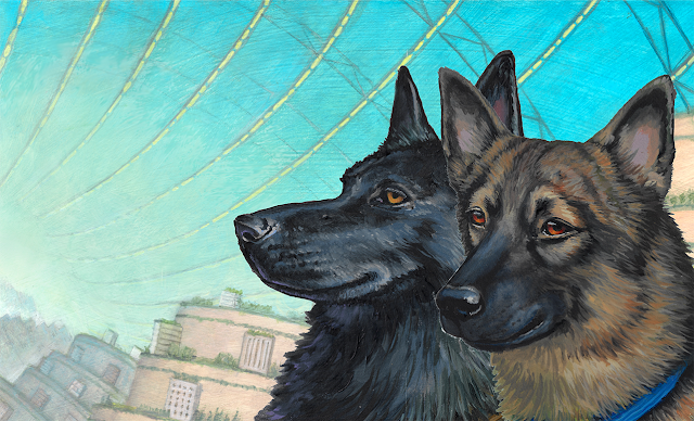
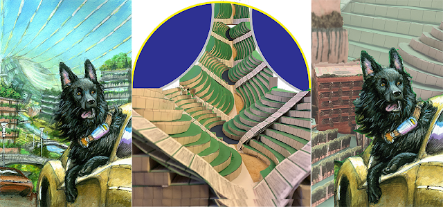
Rex and Shady are silhouetted against the sky-windows of Rana Station.
Rex has since reconciled himself to the view. (background ©2020 by Jody A. Lee; Rex and Shady portrait heads ©2020 by Lucy A. Synk).


The infernal perspective of a habitat wheel

God bless Don Davis and Rick Guidice. They were the first artists to grapple with the technical complexity of painting a landscape as it would appear inside something similar to a massive bicycle wheel in space. They were an essential part of the early NASA Ames Research Center project. In the summer of 1975, they helped a think-tank of genius scientists and engineers develop detailed plans for a habitat in space based on a wheel-like structure, a basic plan first proposed by Konstantin Tsiolkovsky in 1903.

Drawing the thing from the outside was far easier than drawing or painting images of the inside. But Davis and Guidice brought it memorably to life. You’ll notice that two of the three are cutaway views. As the middle image from 1975 demonstrates (below), it’s really challenging to get such an image to “read” clearly. Bending their brains around the crazy view cannot have been easy. But ever since then we’ve had something of a “cheat sheet” to go by.

And also a challenge for their successors. If they could do it, then it can be done.


Visualizations of the interior of a toroid space habitat: Left to right, under construction and a landscape oof the interior; and a cutaway of the interior with homes and landscaped plants.
Visions from the Ames Center in 1975: © NASA; artwork left and center by Don Davis. Artwork at right by Rick Guidice.


An Alien Landscape

Early in the story of A Bone to Pick’s cover, I sent Jody these images from 1975 (she’d already found them for herself, too, I believe). When she sent her first developmental color study, she accounted for the “bent” horizon. Other aspects of Orangeboro’s topography, though? Unfortunately, not so much.

That was my bad. As a writer, it’s easy to airily refer to “the verdant terraces of the Sirius Valley” and go on with whatever is happening in the scene. But an artist has to show it. In considerably more detail than the writer must devote to the subject. No matter how “impressionistic” the artist's technique may be. And you’ll have noticed already that Jody has a beautiful style, but it’s not notably “impressionistic.”

So, okay, Jan. What do you mean by “the verdant terraces of the Sirius Valley”?

Rana Station is supposed to be a self-sufficient space habitat that is home to more than eight million souls. Those are eight million souls who need not only room to live and work, but who also need to eat. Self-sufficient means they need to grow it all on-Station. And that means they need to maximize their food-growing space. Don Davis gave us a rolling, but basically single-level landscape that didn’t include nearly enough growing space for what I had in mind. Rana Station needed something different. This led me to agricultural terraces and river meanders.


At left, Philippine rice terraces. At right a satellite view of a meandering river.
Rice terraces in the Philippines create crop land on a steep hillside (photo © by Allyson Tachiki), and rivers naturally meander (photo by Google via Robert Hodgin).


The Terraces of the Sirius River Valley

I needed a “horizontal space multiplier,” if I was going to feed all those hungry fictional mouths. I also needed to account for some of the natural patterns we know will develop over time, because: physics. Humans have been “making more arable land” for centuries, using agricultural terraces in naturally-steep terrain.

And even from early on, it was pretty clear that there’d be a river running through the torus. If you water the plants in gravity, where does the water go? Check the Don Davis landscape above from 1975.

Moreover, if water flows, it naturally meanders. My Rana Stationers would have to allow for that, too. I also realized that an undulating valley structure, winding in and out, rather than running arrow-straight along the insides of the torus also would be a “horizontal surface multiplier.” For an unscientific example of this, fold a paper fan. Your fan has the same surface as a flat piece of paper, but the flat paper is much longer. The folds condense the surface area.

Thus, I told Jody not only were “The verdant terraces of the Sirius Valley” built like giant stair steps. They also rippled in and out. So, is that clear enough?

Say, what???

The story of A Bone to Pick’s cover grew kind of complex at this point. The superb horticulturalists of Rana Station don’t tolerate unproductive weeds in any precious cubic centimeter of Ranan soil. But at this point Jody and I wandered off into the tall, jungle-thick, metaphorical weeds of trying to communicate with each other. No. it was not clear enough. Not at all.

Frustrated, I resorted to the same expedient Davis and Guidice had, back in 1975: I started making pictures. More accurately, I started making models. I created what I thought were interesting simulations of the perspective. But my models still didn’t communicate what Jody needed.


Left-to-right, Jody’s first color study for the cover of “A Bone to Pick,” Jan’s photo of the maquettes she’d constructed, and Jan’s cut-and-paste mashup of Jody’s Rex-in-car sketch over photos of Jan’s maquettes.
At left is Jody’s first color study. Center and right are Jan’s attempts to use 3-D paper maquettes to describe the terraces, switchbacks, and a model of Corona Tower cut-and-pasted behind the sketch of Rex in the car. No, they didn’t make sense to Jody, either. (artwork © 2020 by Jody A. Lee and Jan S. Gephardt, respectively).


Something Like Wavy Layer Cakes

It’s a good thing we had started working on this project well before I needed it, or the story of A Bone to Pick’s cover might have turned tragic at this point. It took me a long time to produce a drawing that more clearly communicated what I needed to convey to Jody (see below left). It’s not great art, and since my studio was mostly in boxes while we put in a new floor, I wasn’t able to develop any kind of perspective for the buildings beyond “eyeballing” the angles. It was crude. It was stiff. Frankly, it was an embarrassing drawing.

But once I sent it, we were finally on ever-more-synchronized wavelengths. I had begun to fear we’d never get there. That she’d tell me to take my stupid job and shove it. But Jody is a pro, and she stuck to it. And when it comes to visualizing something that is purely hypothetical and may never exist in real life, I guess you can’t beat a fantasy artist.

I was startled and distracted by how much my terraced hills looked like layer cakes, but by now Jody had a firm vision and a much less meandering route to the finish line. She took things masterfully from there. We exchanged a series of sketches, and she got to work on the final painting.


Left to right, Jan’s first, stiff sketch in a sketchbook; Jody’s response, based on it; and Jan’s refinement on the idea, with more terraces, in response.
A “conversation” between artists: evolving views of the “verdant terraces of the Sirius Valley.” Artwork © 2020 by Jan S. Gephardt, Jody A. Lee, and Jan S. Gephardt, respectively.


The story of A Bone to Pick’s Cover

So that’s the story of A Bone to Pick’s cover. I hope that this collaboration has not only produced a cover to make you smile (and buy my book???). I hope that the whole process of working through questions of “exactly what do you mean by that?” and “what does that look like?” has made A Bone to Pick a better book.

You can find out for yourself it it did, on (or after) the release date, September 15, 2021. If you’re interested, you can pre-order a Kindle version in either the USA or the UK. After release, it’ll be available from a variety of booksellers in a variety of formats.

IMAGE AND OTHER CREDITS:

The excerpt from What’s Bred in the Bone is © 2019 by Jan S. Gephardt, published by Weird Sisters Publishing LLC. All rights reserved.

Of course, the vast majority of the artwork in this post is © by Jody A. Lee. The EStee sketch is © 2016 by Jeff Porter. There also are some sketches that are © 2020 by Jan S. Gephardt. And the “head shot” portraits of Rex and Shady are © 2020 by Lucy A. Synk.

The book covers at the beginning come from a variety of sources. That first cover, for The Black Gryphon, is courtesy of Amazon. The covers for A Study in Sable and By the Sword are courtesy of Goodreads. And the cover for The Hills Have Spies is from Penguin Random House.

Imagery and all kinds of rich information from the NASA Ames Research Center makes my life as a science fiction writer infinitely easier, and continues to yield more treasure each time I explore it. And I can’t begin to express the impact the artwork of Don Davis and Rick Guidice has had, both on my work, and on the conception of Rana Station. Seriously, guys. It’s a debt I can’t ever repay.

Farther down, the photo of the Batad Rice Terraces in Banaue, Philippines is © by Allyson Tachiki via Flickr. It offers a great example of how humans have learned to “make more land” out of very steep terrain. The satellite photo of an unidentified river meander originated from Google. But I found it on Robert Hodgin’s fascinating exploration of river meanders. Do yourself a favor and check out that web page when you have a minute. It’s pretty amazing.