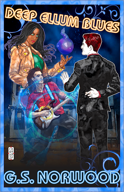
Creating the cover for Deep Ellum Blues called for collaborative vision. G.S. Norwood’s latest novelette is set for release on Amazon September 30, 2020.
To visually represent it, we needed a cover with something old, something new, and something recognizably magical. In pursuit of that, G., cover artist Chaz Kemp, and I blended ideas from three different creative viewpoints.
 |
| From Weird Sisters Publishing LLC: Cover art for Deep Ellum Blues © 2020 by Chaz Kemp. |
The cover of a book has to do a lot of things all at once, and it has to do them at a very small size. Amazon sure isn’t making its thumbnails any bigger than it has to, as you may have noticed. I’ve written other “how we made this cover” posts for Deep Ellum Pawn and The Other Side of Fear.
The cover must catch a prospective reader’s eye. Telegraph the genre. Offer a glimpse of a hint of the story that makes our ideal reader curious, and ideally it makes them want to click to find out more. And when it’s part of a series, it also has share identifying characteristics that make it look like it belongs in that series.
I’ll take these out of order, but here’s how we tried to satisfy each one.
A glimpse of a hint of the story
Stories are why we read fiction. If the cover offers an effective tease about the story within, most readers will want to know more. The difficulty lies in the tease. A cover that gives the whole story away is no fun. A cover that’s merely puzzling can be a turn-off. So we have to strike a balance.
At Weird Sisters, we respect artists’ vision. Rather than hand an artist a short description of what we think should be on the cover, we prefer that the artist read the story first (we’re even willing to pay extra for the time this takes). Artists, especially those who’ve designed covers in the past, often come up with great, graphically striking ideas that we haven’t even thought of.
Even if the first idea doesn’t quite nail it—and they almost never do—it offers a place to start. It’s all part of developing a collaborative vision.
For this project, we worked again with the talented Colorado artist Chaz Kemp. He created the cover for the first story, Deep Ellum Pawn. He already knows and has developed a portrayal for Miz Eddy, the main character. And we greatly value his willingness to work with our ideas as well as his own.
 |
| Artwork © 2020 by Chaz Kemp. |
Chaz’s first suggestion focused on a pivotal moment in the story. I wasn’t sure it quite expressed what we wanted it to, and G. worried that it gave away too much (should I have included a spoiler alert?). But we both agreed he’d hit on an excellent moment to dramatize.
Portraying Miz Eddy and the others
Chaz already had developed a strong character image for Miz Eddy Weekes on the first cover. She’s a strong, no-nonsense character with a blend of ethnic roots. Her strength came through clearly on the first cover, but in the scene we wanted to target she’d be facing an adversary, the recurring character we met in Deep Ellum Pawn as Nick.
 |
| Artwork © 2020 by Chaz Kemp. |
We went through a sequence of ideas to develop a body position and facial expression that we all agreed worked best for the scene.
We followed similar procedures with the other characters. Nick and Mudcat have specific traits that a good character portrayal can communicate. In Mudcat’s case, he also had to have one special, very specific guitar, which is clearly identified in the story.
A passionate music lover wrote this story, and it shows. People of any musical understanding can enjoy it, but it’s got a lot of cool “inside stuff” for other music lovers. Especially those who love the Blues. With good reference material from G., Chaz gave us the exact-right guitar. For those who know the Sons of Hermann Hall in Deep Ellum, TX, and its history, the background offers yet more authenticity.
Eye-catching, genre-specific, and series-consistent
For the first releases of the Deep Ellum novelettes, we’re publishing in Kindle Unlimited. They’re short enough to belong in Kindle’s “90-minute Science Fiction and Fantasy” category, but a paperback turned out to be impractical for something as small as a novelette (when the fourth one’s done, we’ll publish an omnibus edition to multiple platforms, as both ebook and paperback).
But that means the cover has to be eye-catching, even in a postage-stamp size. And it needs to be understandable, even in black and white—since some ebook readers don’t do color. We started out early, testing for “readability” in black and white. The way to achieve that is by using contrast.
 |
| Artwork © 2020 by Chaz Kemp. |
Our primary source of contrast is also an element that conveys “magic.” So is the difference in scale between Miz Eddy, Nick, and Mudcat. This story is technically urban fantasy or occult fantasy by category, so we needed to make the magic an easy-to-see element.
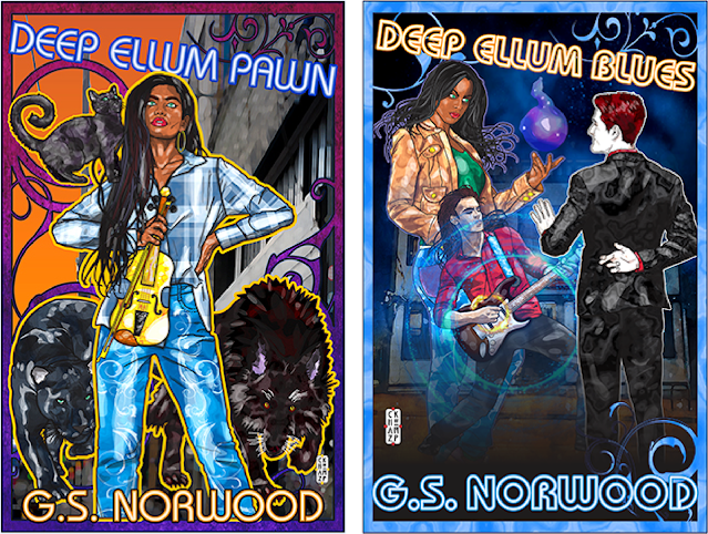
Finally, to make it clear this is part of a series, Chaz used the same type font, angle, and positions for the title and the author’s name on both covers. We also used the same kind of frame element around the edges.

From Weird Sisters Publishing LLC, cover art for Deep Ellum Pawn © 2019 by Chaz Kemp. Cover art for Deep Ellum Blues © 2020 by Chaz Kemp.
I hope you’ve enjoyed this description of how G., Chaz, and I developed our collaborative vision for the cover of Deep Ellum Blues. I’ve written other “how we made this cover” posts for Deep Ellum Pawn and The Other Side of Fear, if you’d also like to see them.
IMAGE CREDITS
All of the artwork in this post is by Chaz Kemp. The cover and working images for Deep Ellum Blues are all ©2020 by Chaz Kemp. The cover of Deep Ellum Pawn is ©2019 by Chaz Kemp. All rights reserved, but it’s fair use if these images are used as commentary, and this post, Chaz Kemp, and Weird Sisters Publishing are identified and credited, with hyperlinks to the sources included.
No comments:
Post a Comment